Hello.
It’s so overdue, and I have no excuse as now I have my portfolio site, so here I am, starting a blog!
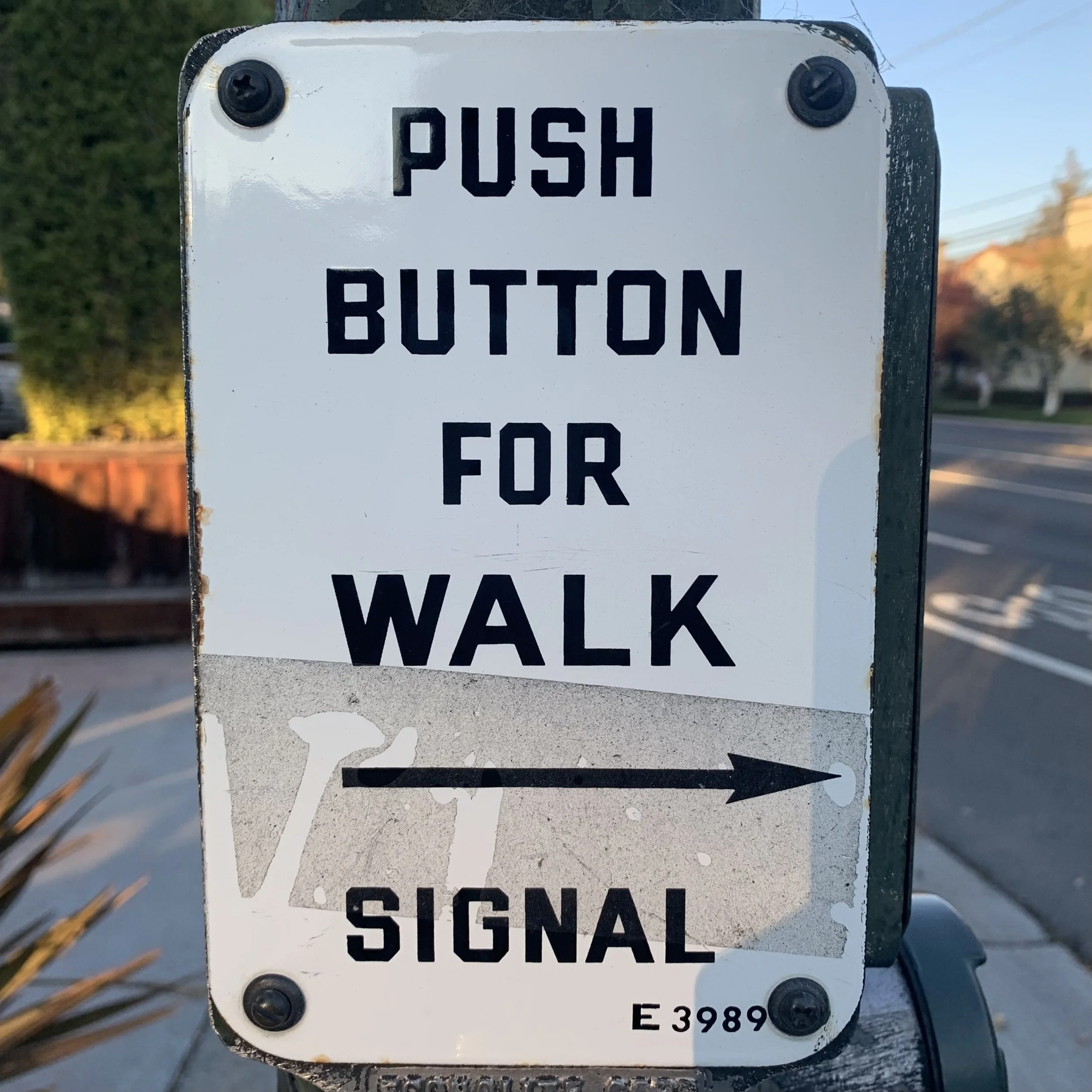
I’d like to write stuff that is related to design, but I may get distracted and write about something else from time to time. Today, I am going to write about this sign I saw during my evening walk.
I’ve been interested in typography for a long time. I pay attention to them more and more as I study UI Design.
I like this sign and the typeface for some reason. I think over the years, I’ve been learning how to articulate and state why I like what I like with words.
So, I like this look… why?
I think it’s got a nice balance of black and white.
I think it looks clean and not loud even though they are all caps.
The narrower arrow has a nice touch. The peeled sticker adds character.
It’s got warmth and friendliness like an old poster instead of a dry and cold plate.