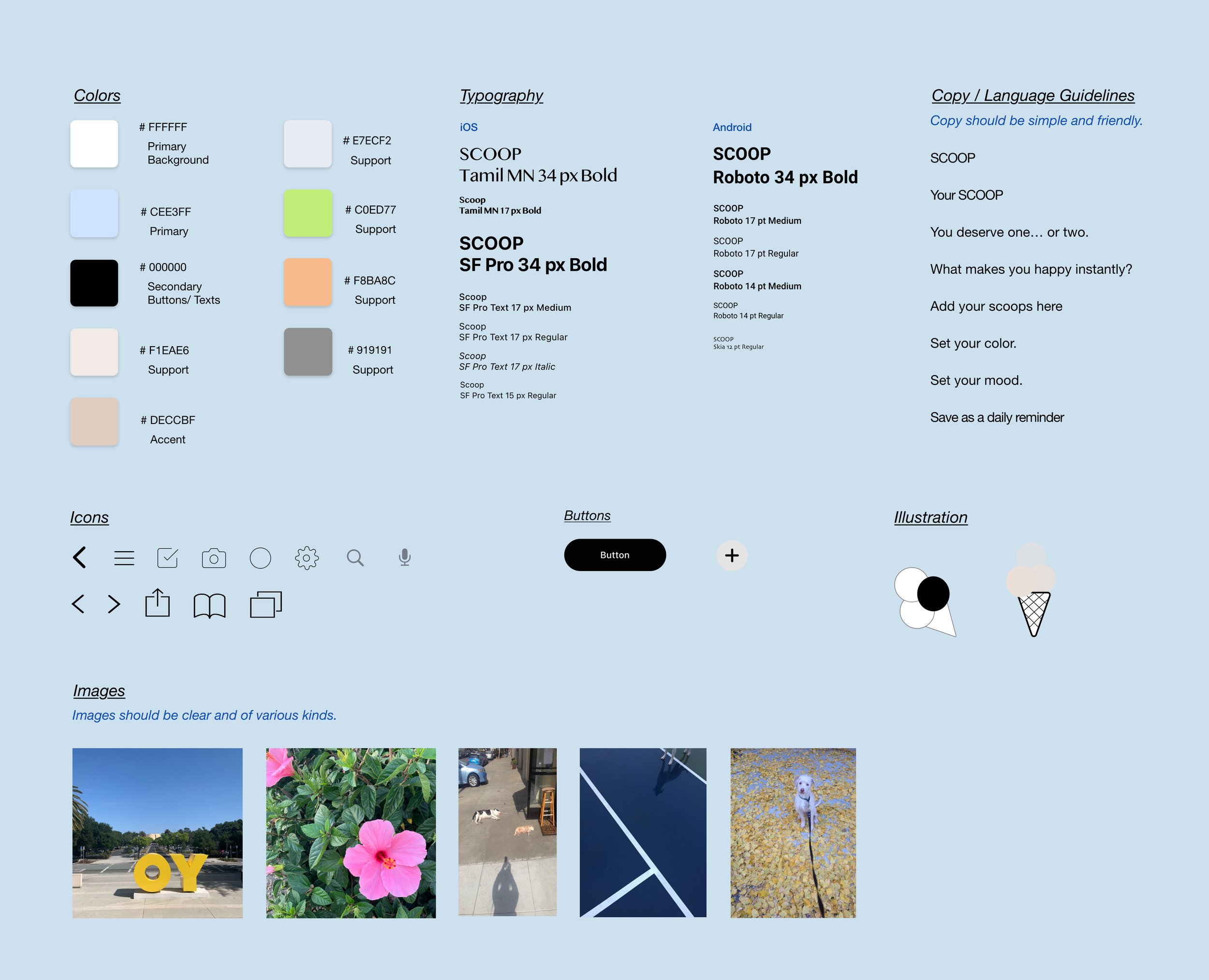
UI/UX Case Study • a mobile app for ios and android
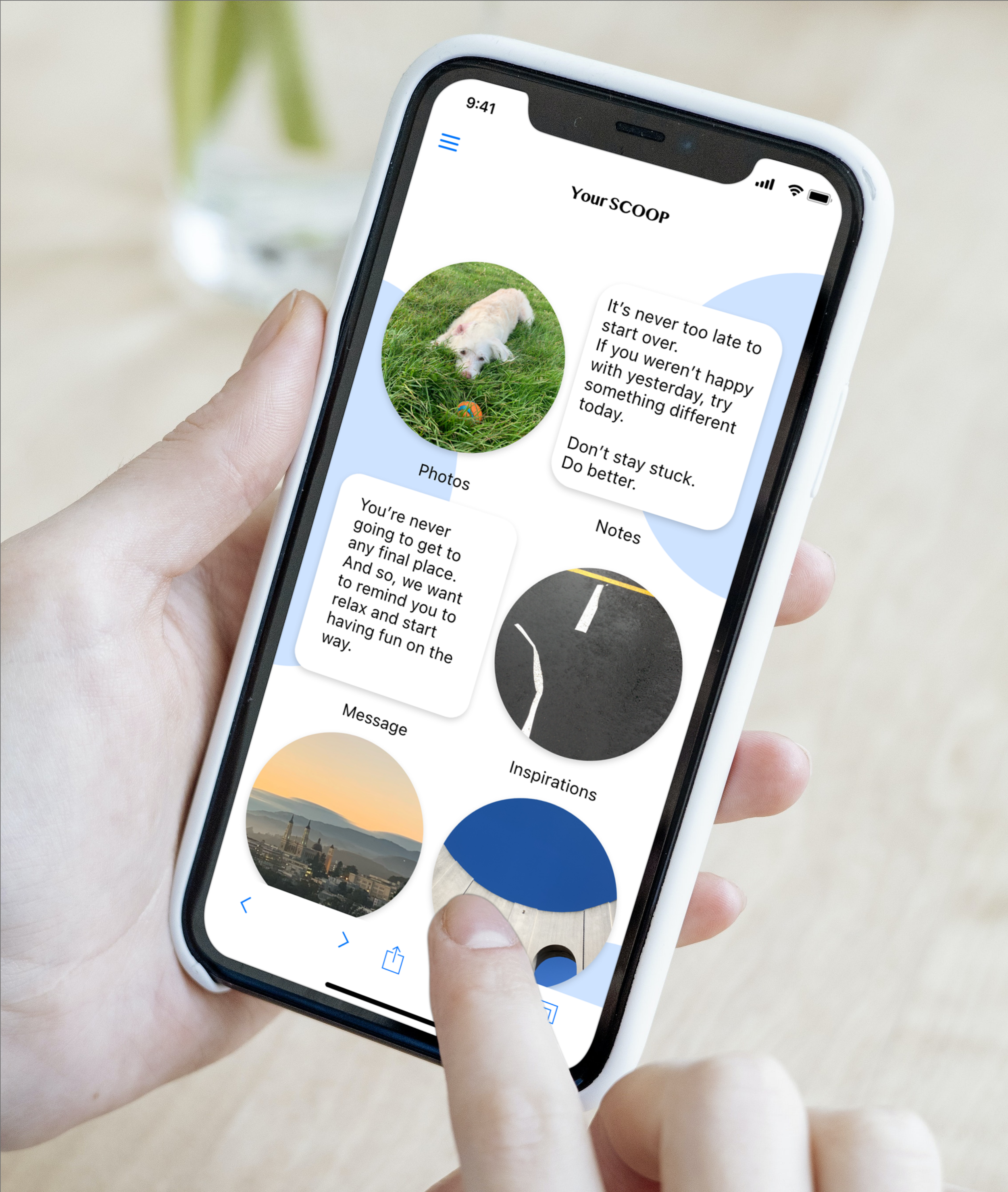
The app collects everything that makes you happy instantly.
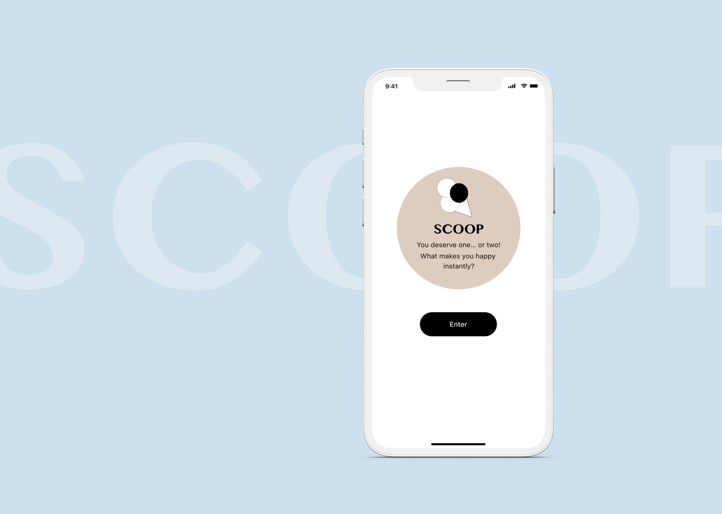
You deserve one… or two.
What makes you happy instantly?
SCOOP is a non-existing mobile app for iOS and Android for people who want to keep
everything that makes them happy in one place.
LIKE ATTRACTS LIKE
If we all try to tune up our moods, we should have more pleasant times with each other, right? This app will help us to be in a good mood instantly. The users collect pictures they like, quote they want to re-read later, and thoughtful messages from their friends and family in one location. When you feel a little down, they will help you to feel better as you look through them.
I came up with the name SCOOP from ice cream scoop. When do people find little happiness? It lets us forget about the problem for a while. “Let’s go get ice cream!” “Do you want some ice cream?” is like a magic word to lift the situation instantly and share moments with your friends and family.
I started by talking to my friends and family to understand what makes them happy, and how they connect with these things.
User Research
My goals for this research:
1. Get some ideas of how people organize things they like digitally. (i.e. images, pictures)
2. Find out when they see them.
3. Find out what the potential user expects from this app.
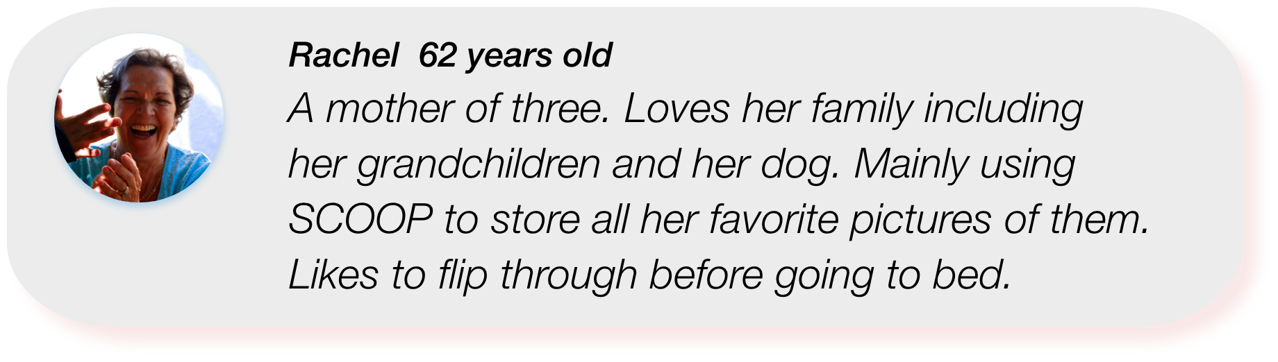
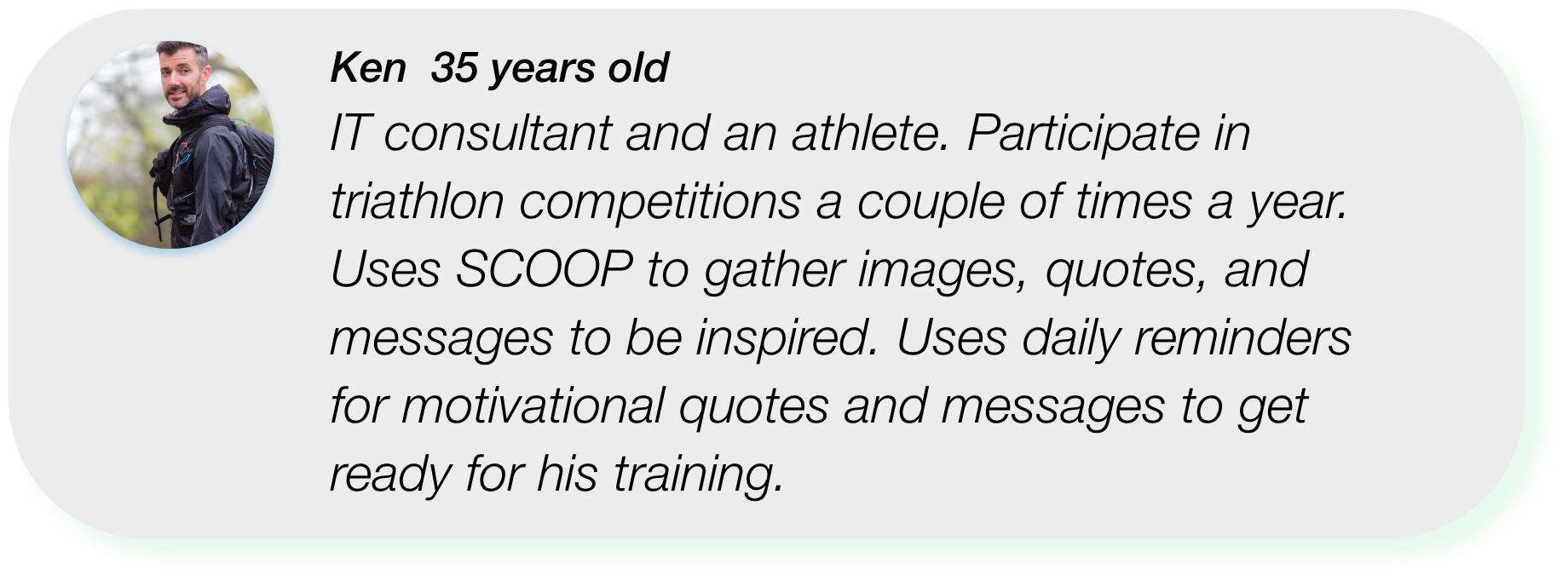
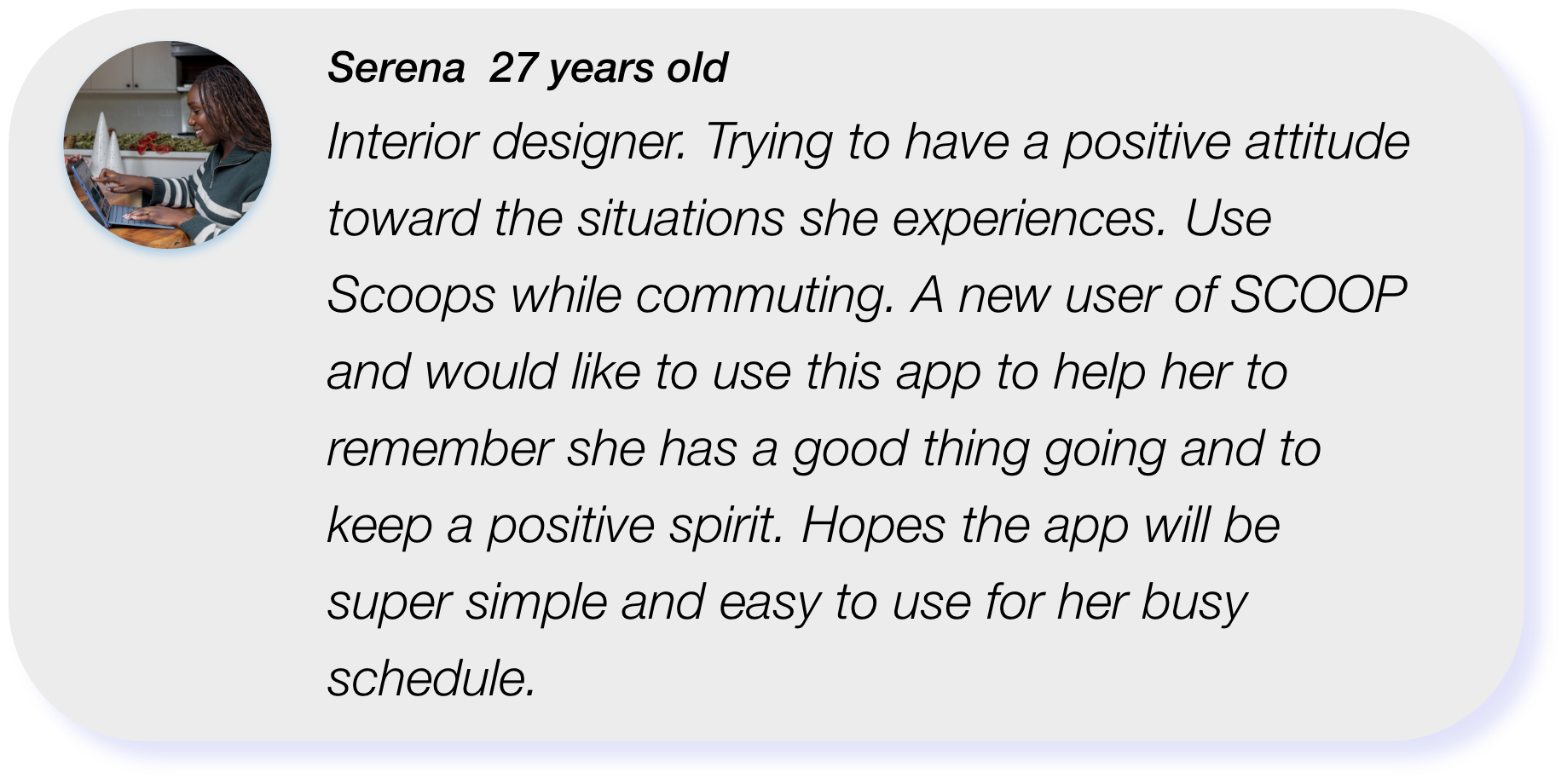
Based on some answers, I created three personas.
Competitive Analysis
Day One: A journal app
This app can create journal entries with locations, weather, and music you were listening to when you wrote them.
Key features include:
1. Directly type into the app note
2. Access to Photo Library on your phone and Camera and Video feature available on the app
3. Add them to the calendar as an event
4. An option to create a daily reminder
My key learnings:
1. It is a simple and calm design.
2. Many great tools on the app are available to create a journal, but
these options are shown repetitively and could be confusing.
3. Clean look is inviting and motivational.
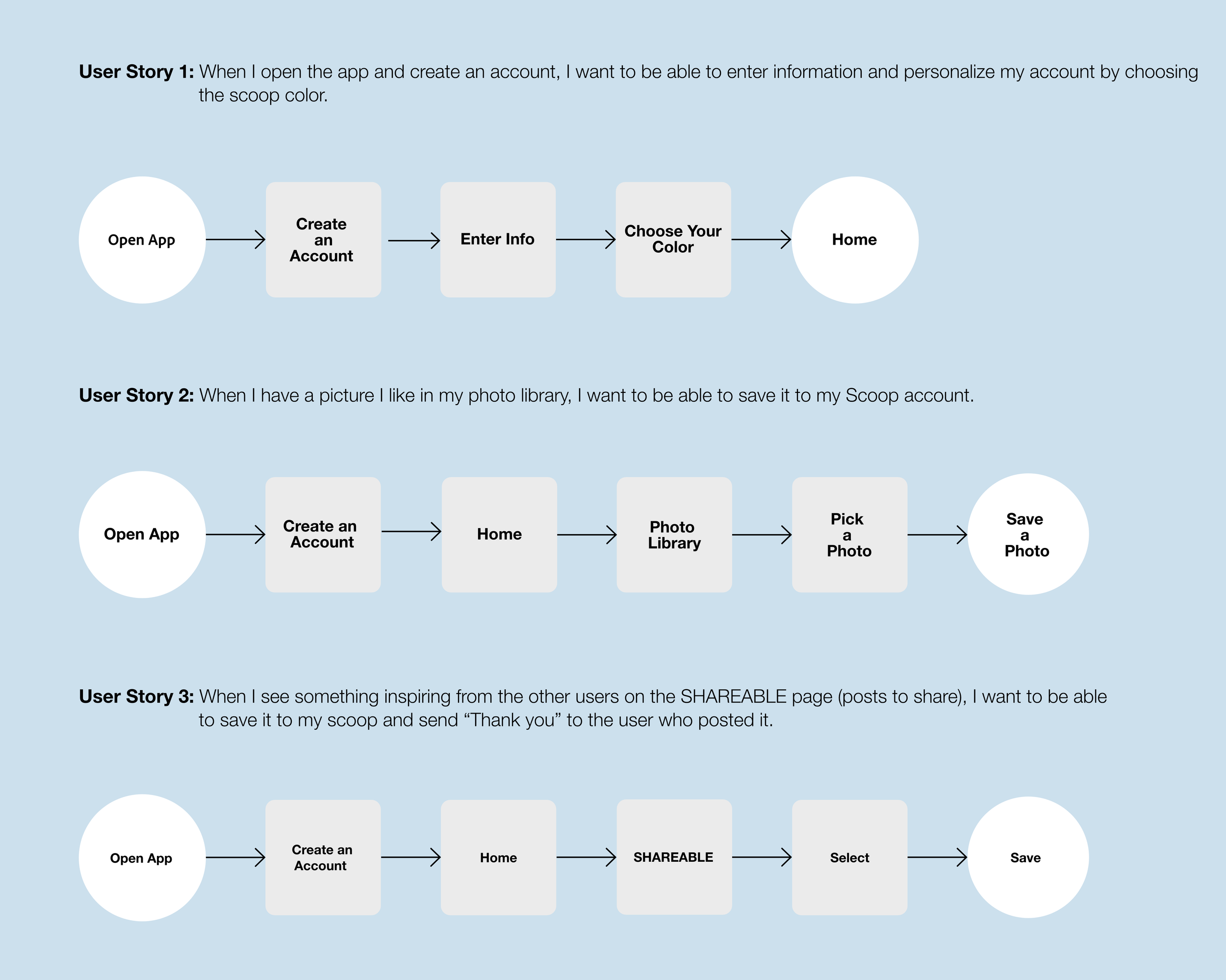
User Flow Diagram
Based on the research and personas I created, I have developed some user stories.
Low Fidelity Sketches
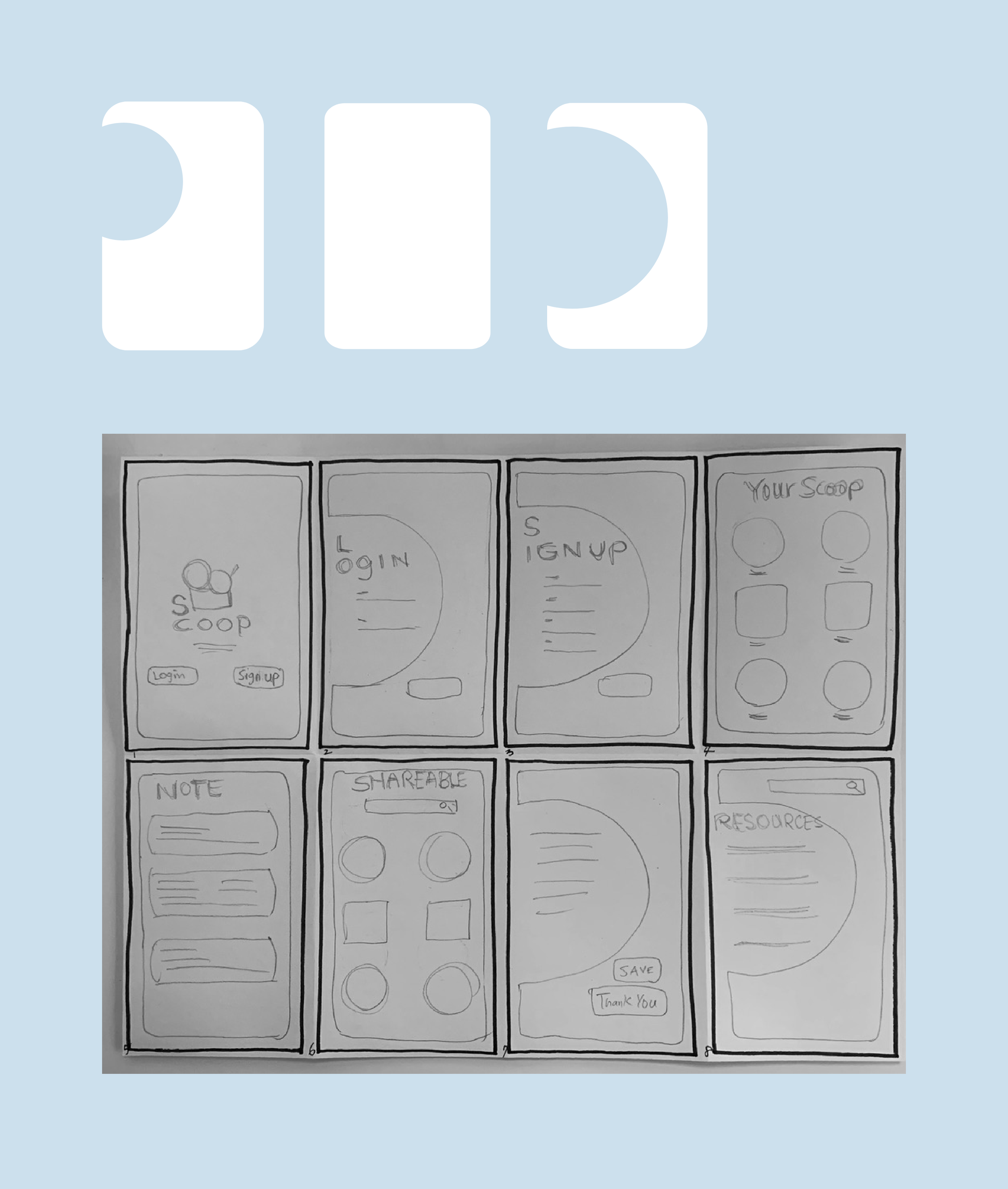
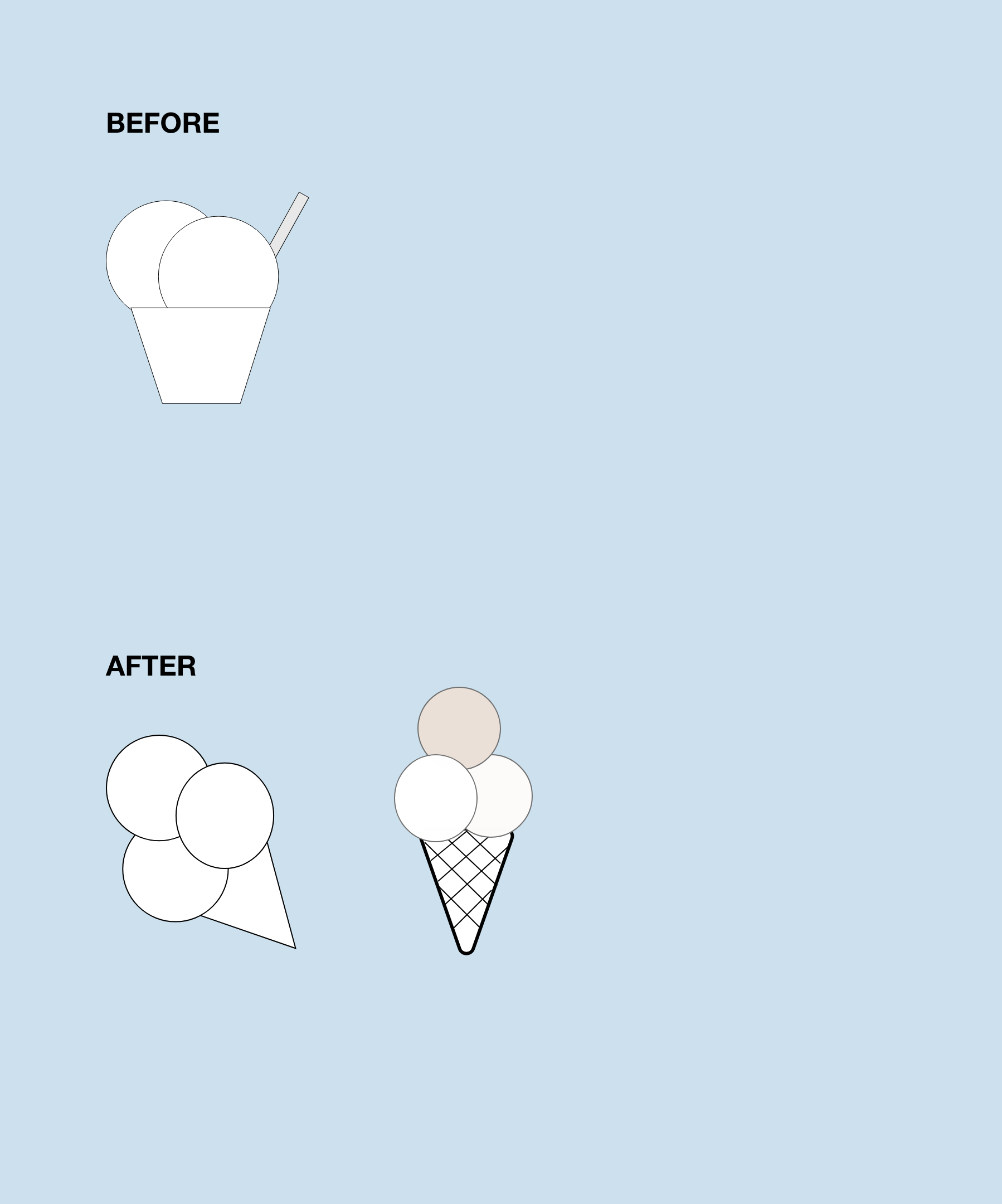
Originally I wanted to use a round frame design
like ice cream scoop shapes.
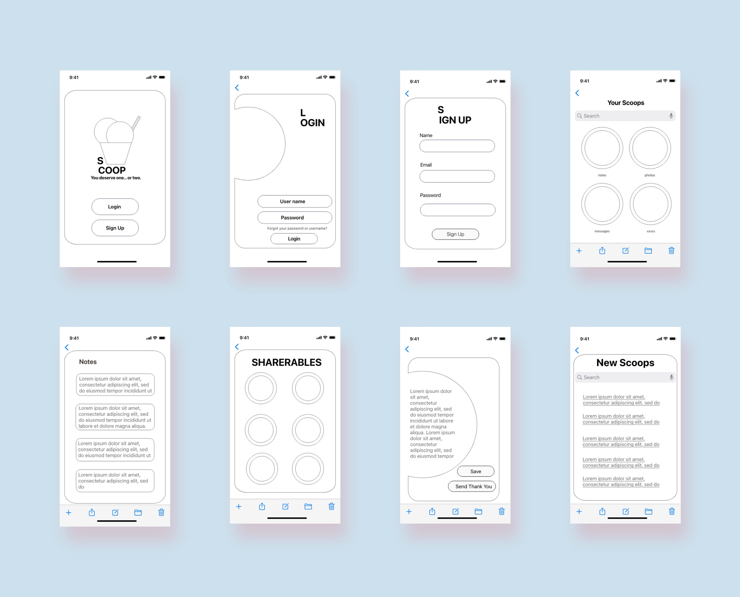
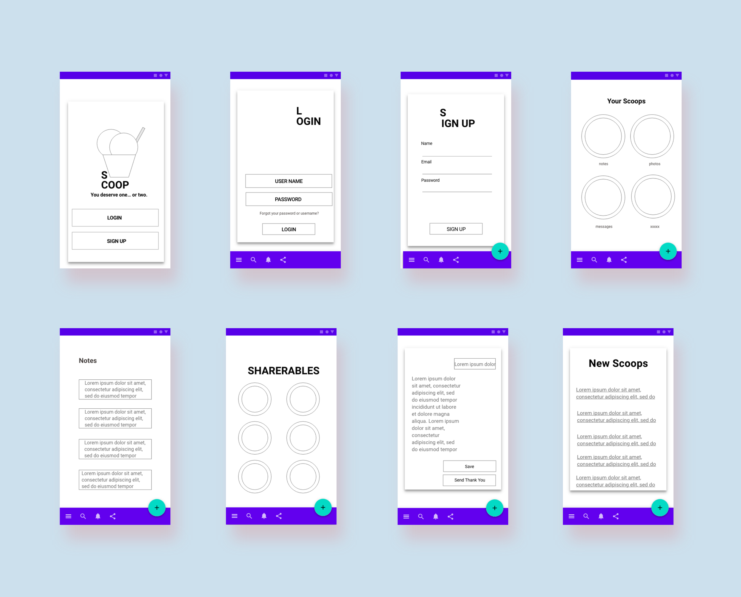
Low Fidelity Wireframes
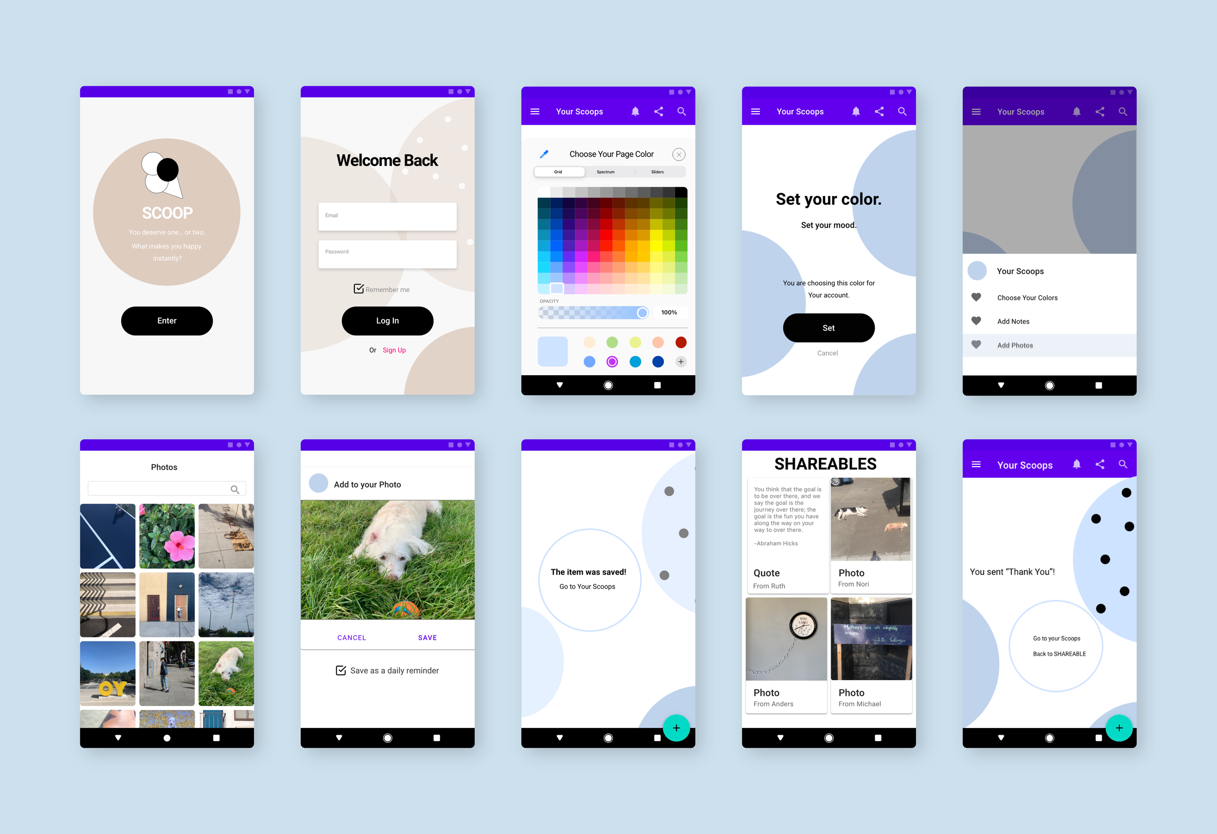
iOS
Android
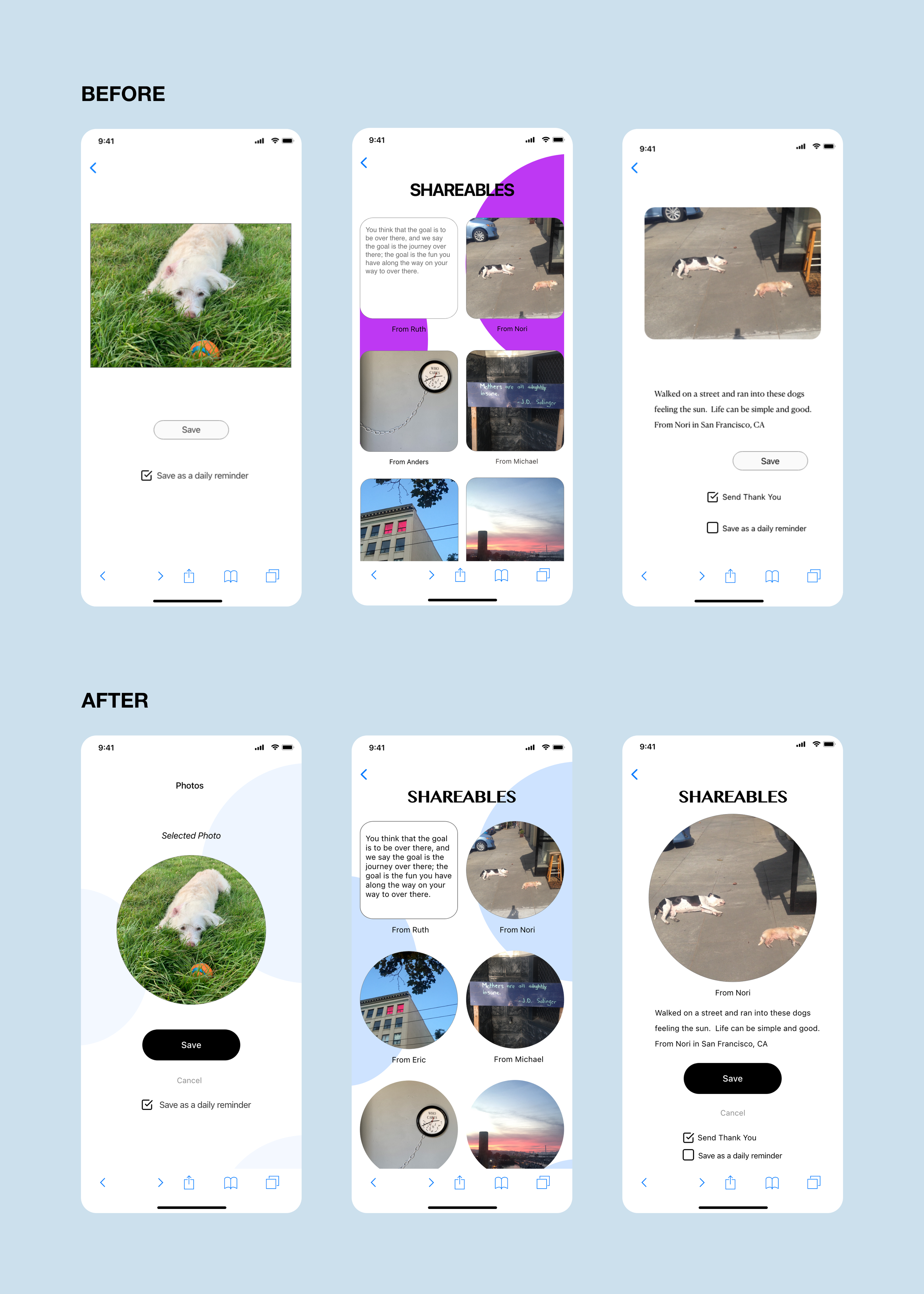
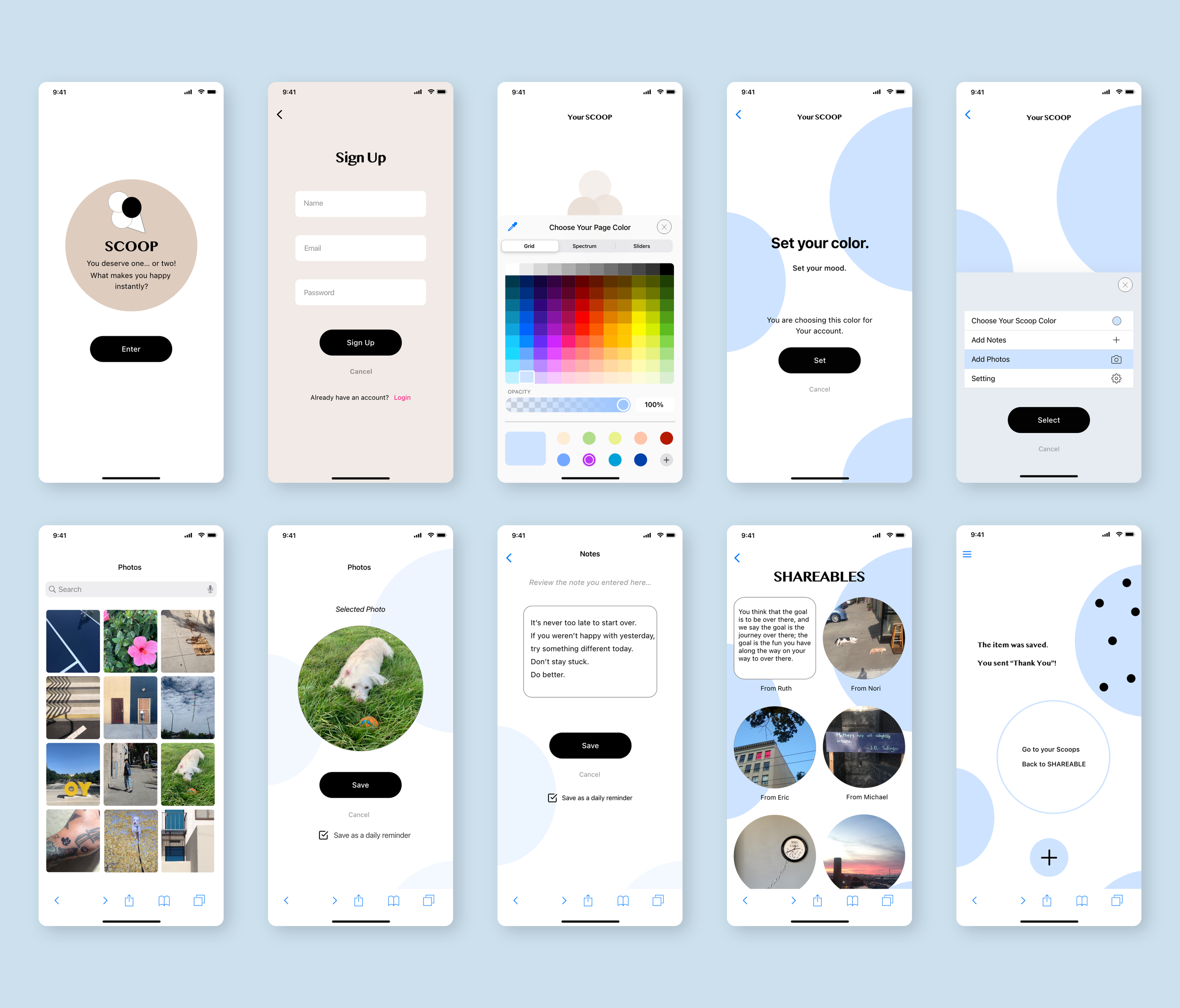
Design Updates
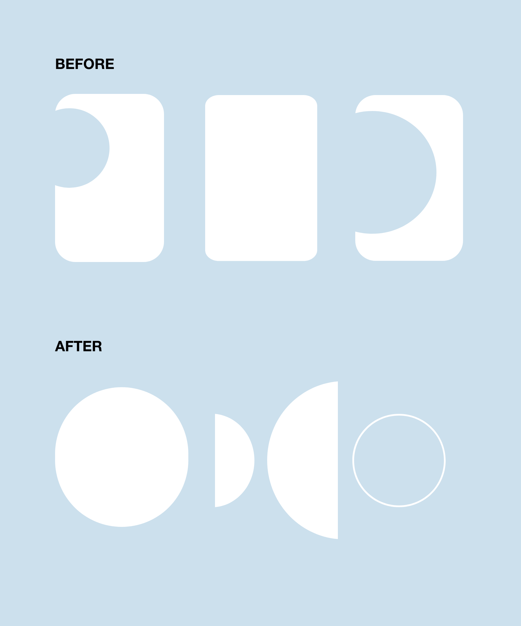
After researching other apps and reviewing my initial design with my mentor in the course, I decided to make the design simpler and not use the “frames” below that I wanted to use to represent “scoops” of ice cream. It may confuse the users.
I also changed the logo to align better with the new page designs by showing circles
User Feedback
1. The “Scoop” should be rounded for the ice cream scoops theme.
Changed the square cards to circles.
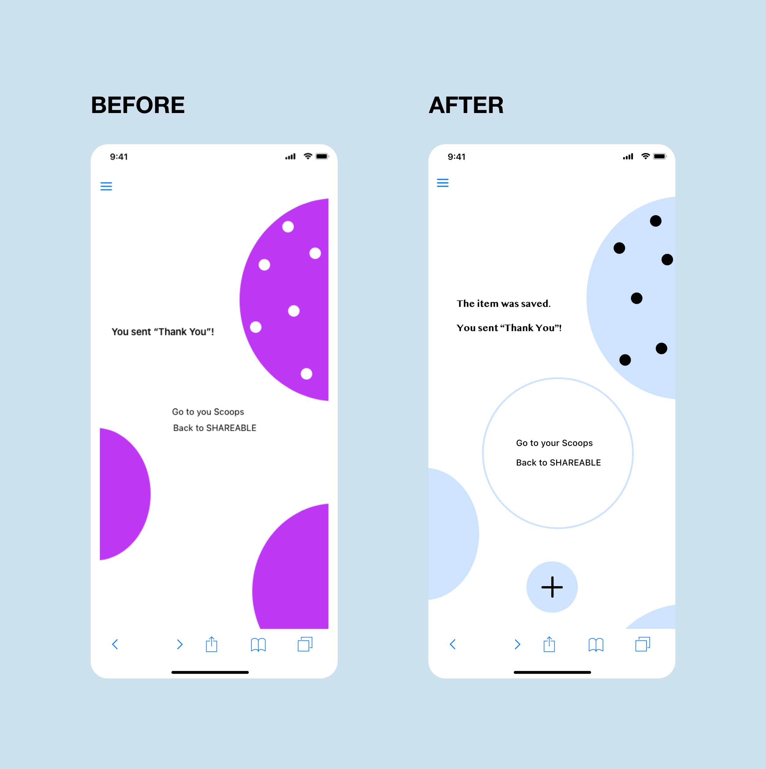
2. “Go to scoop” “Back to Shareable” were lost on the pages.
Added a circle to guide eyes to read the words.
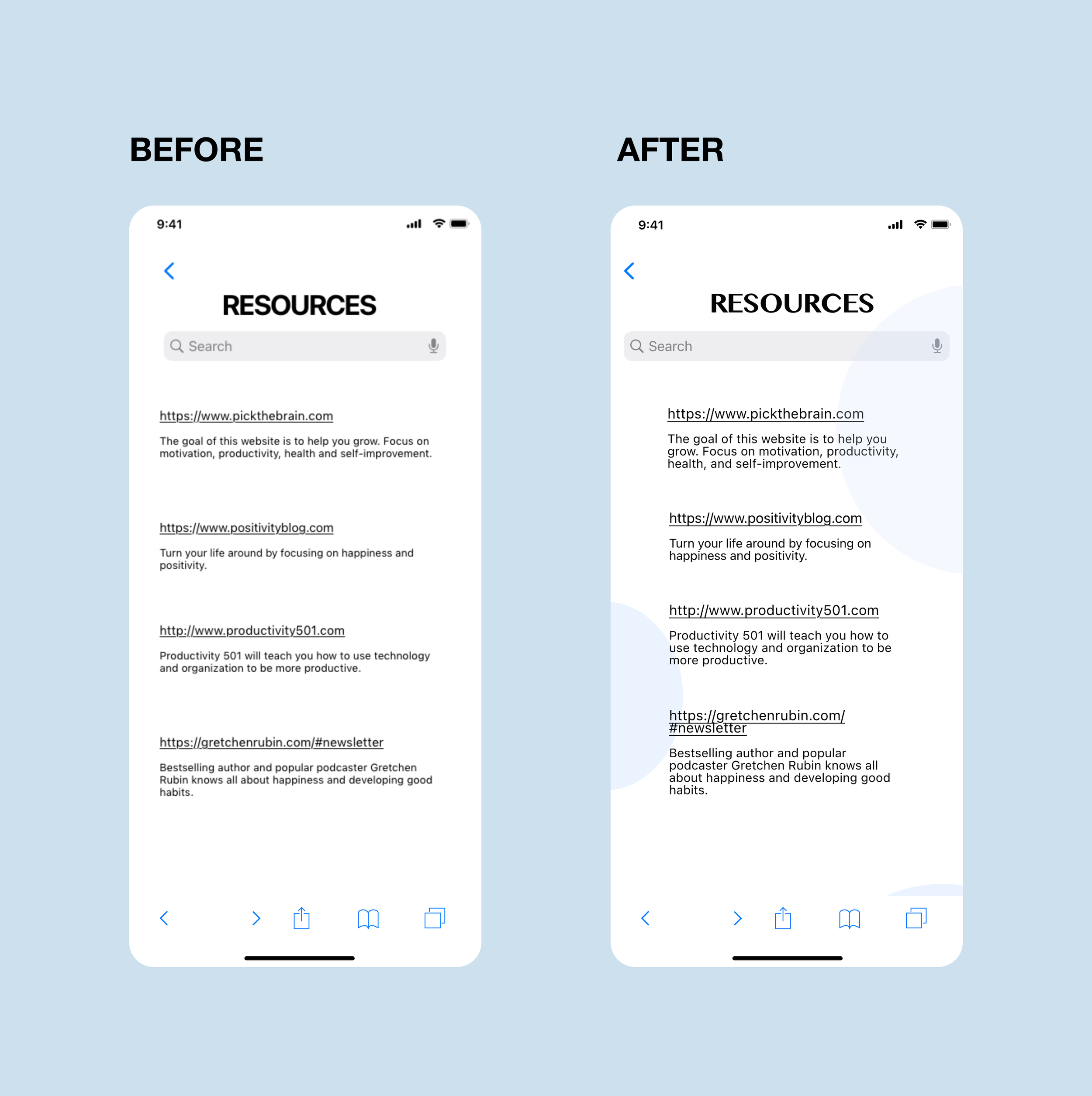
3. The “RESOURCES” page should look a bit more fun.
Added colored scoops as background.
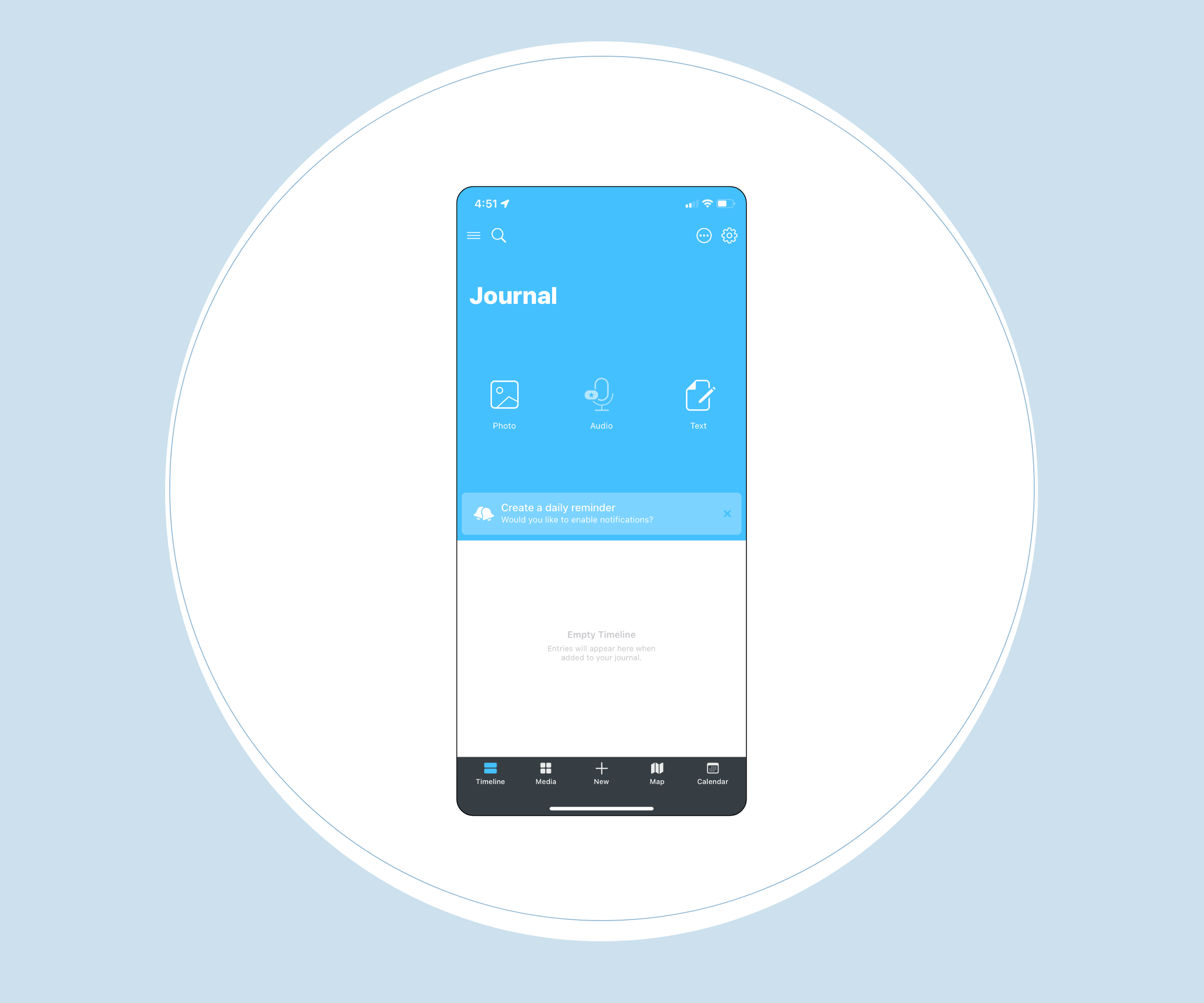
The Final Prototype
High Fidelity Wireframe
iOS
Android