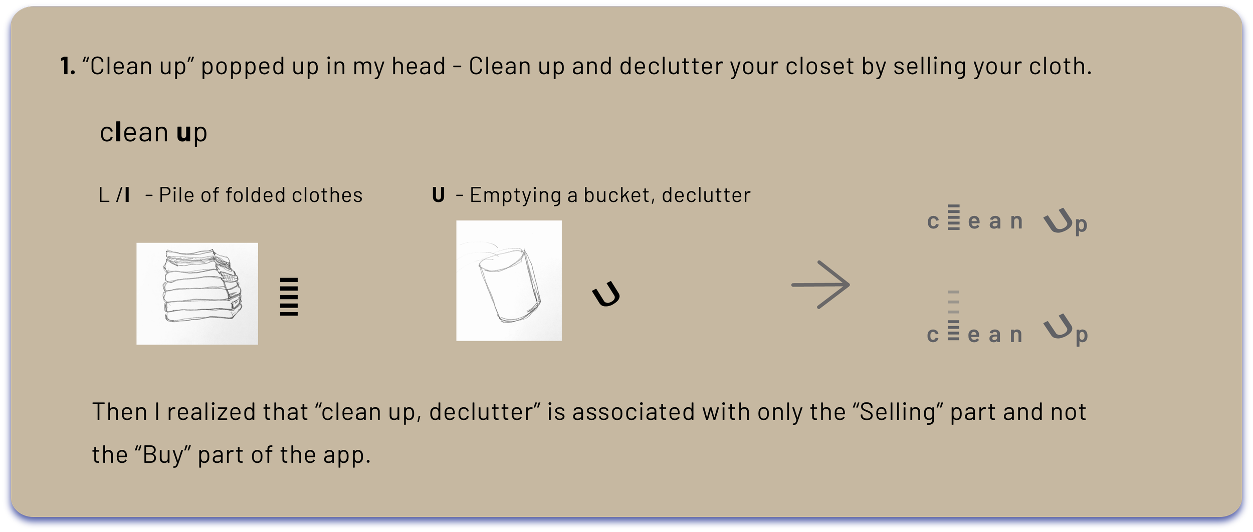
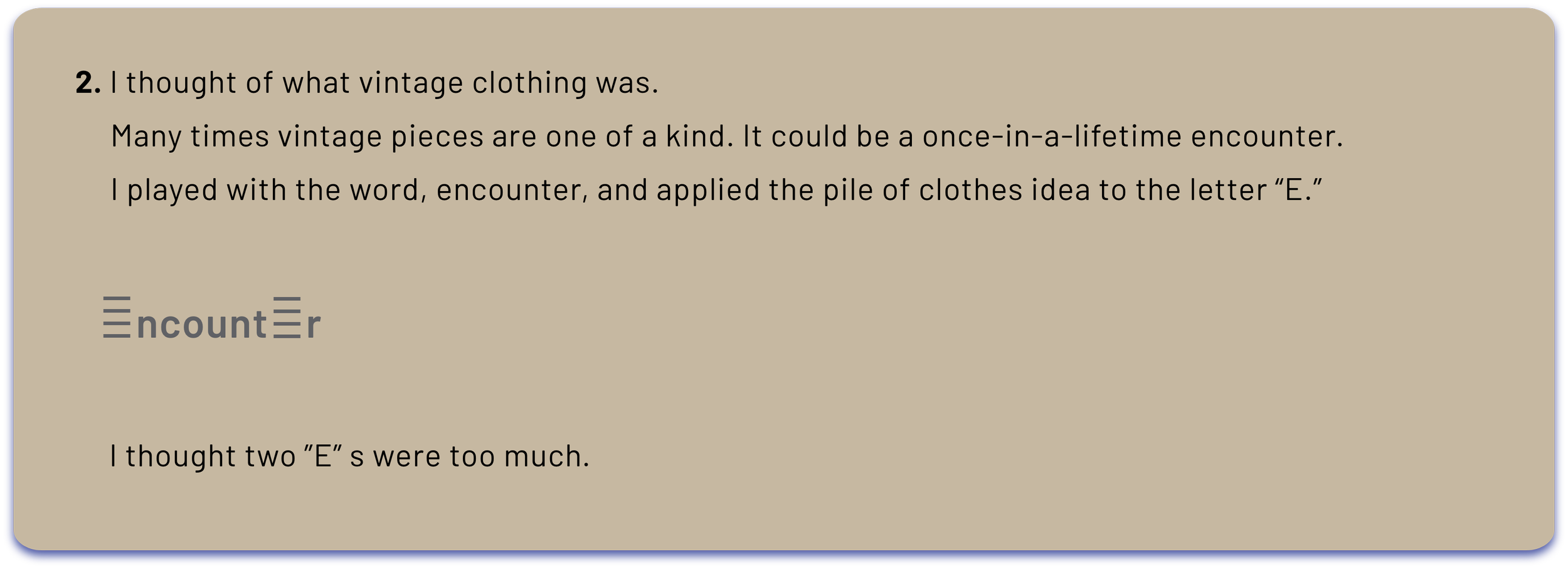
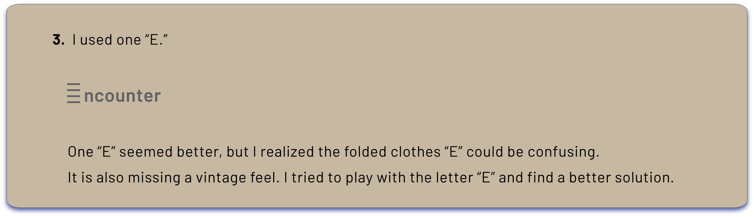
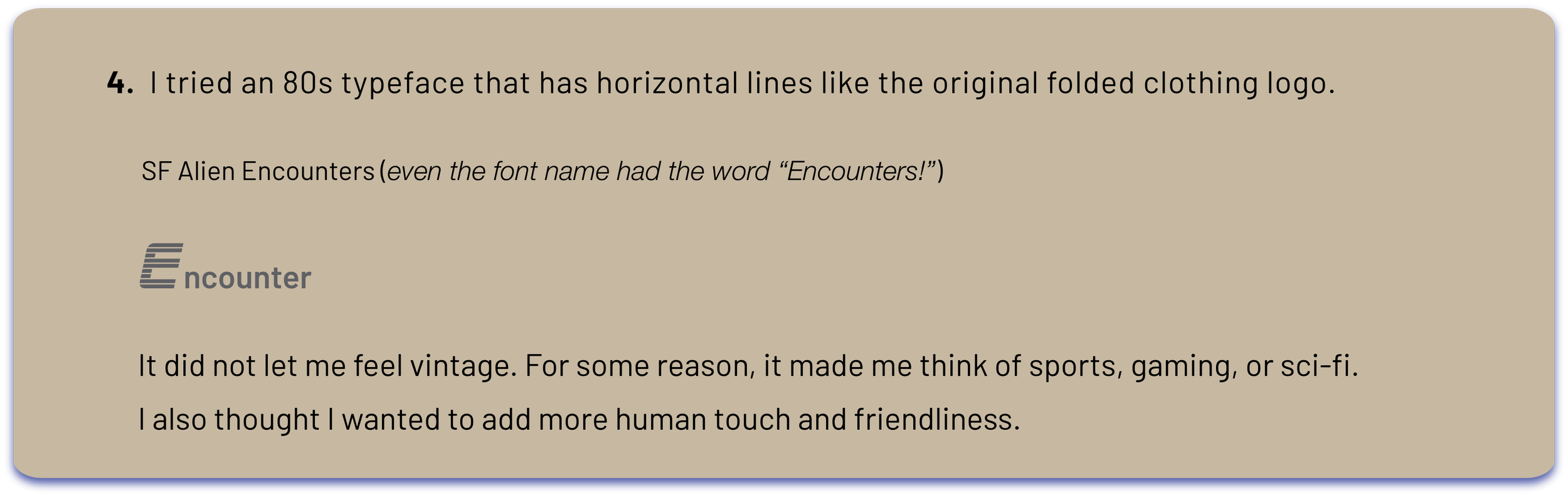
UI/UX Case Study •A Vintage Clothing Sales App

Once-in-a-lifetime
encounter
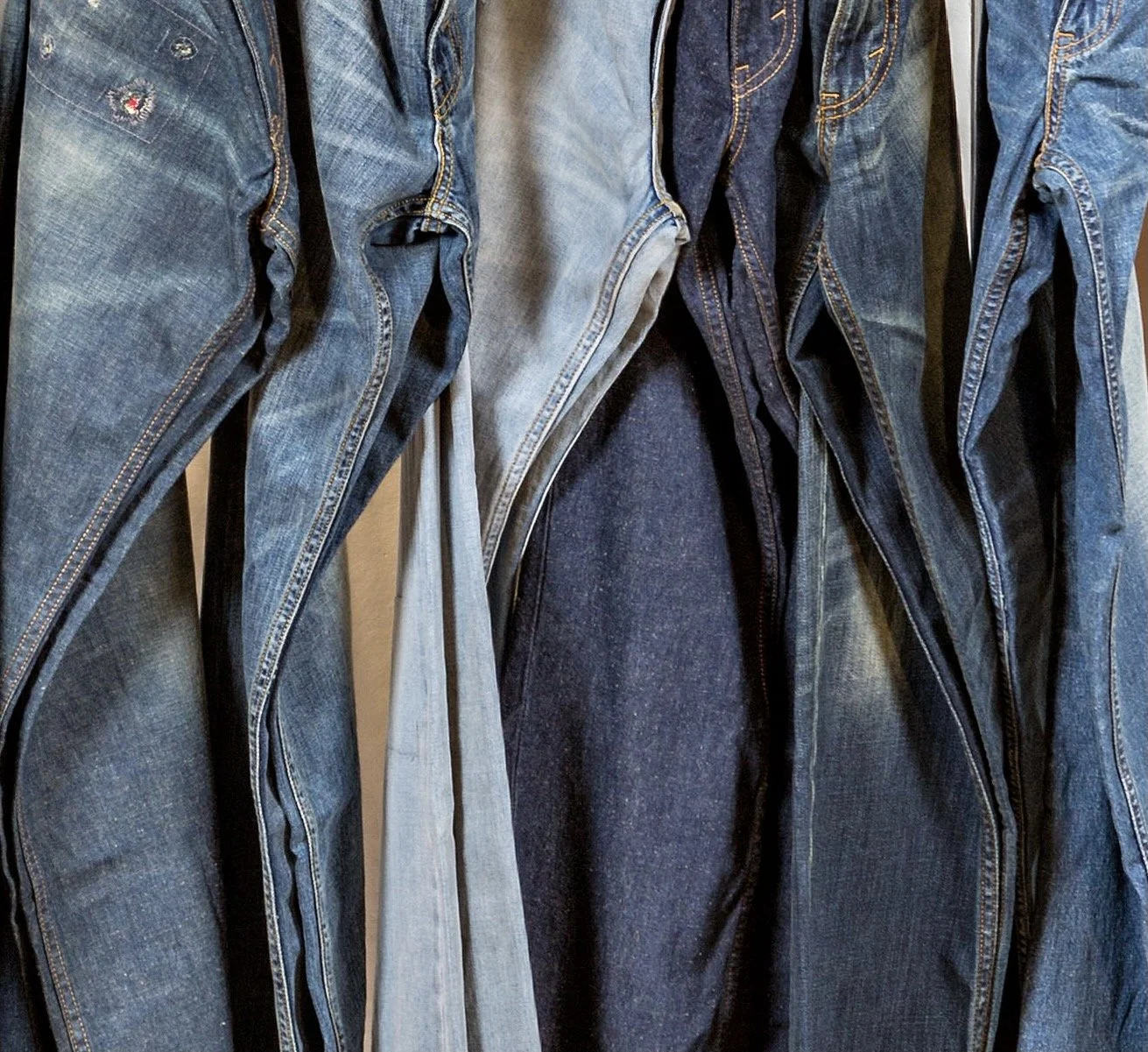
I like vintage clothing. (I also like old furniture and buildings. I love old things.)
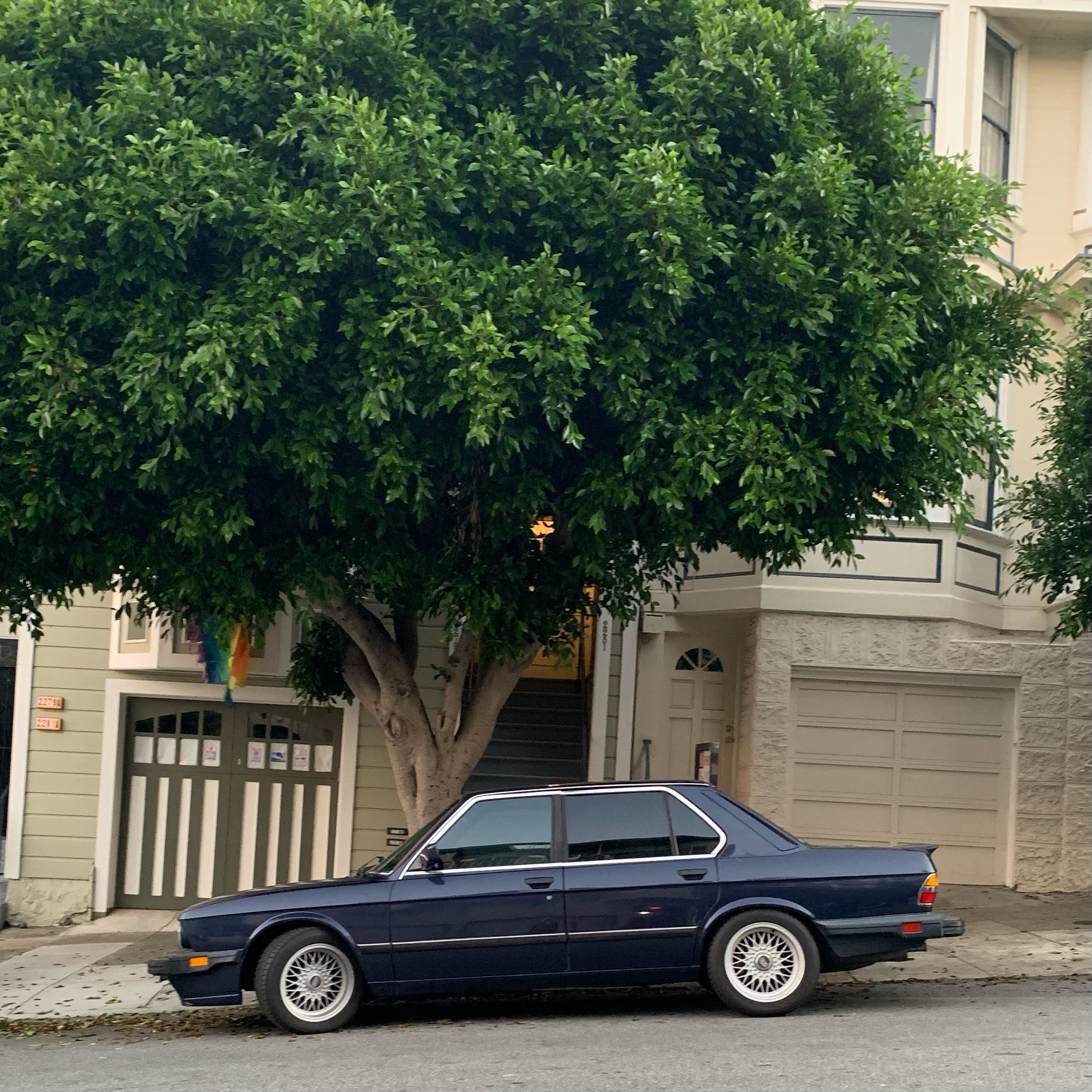
They’ve got history and characters, and mixing and wearing them with new items adds unique character to the look. Chances are slim to run into someone who would be wearing the same one.
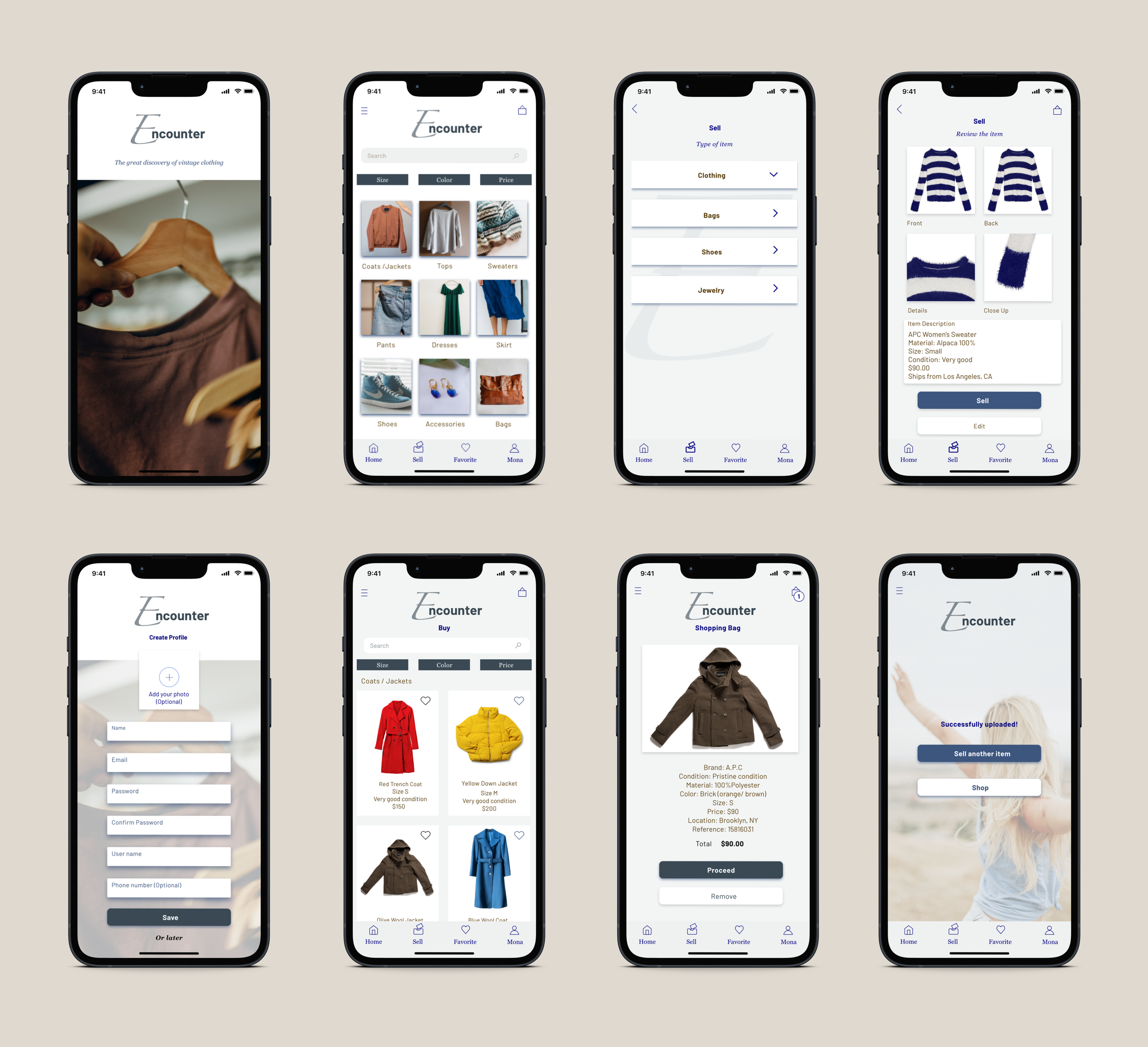
This non-existing app was for a project to design the UI for the mobile version of a vintage clothing sales app and I was excited to create one.
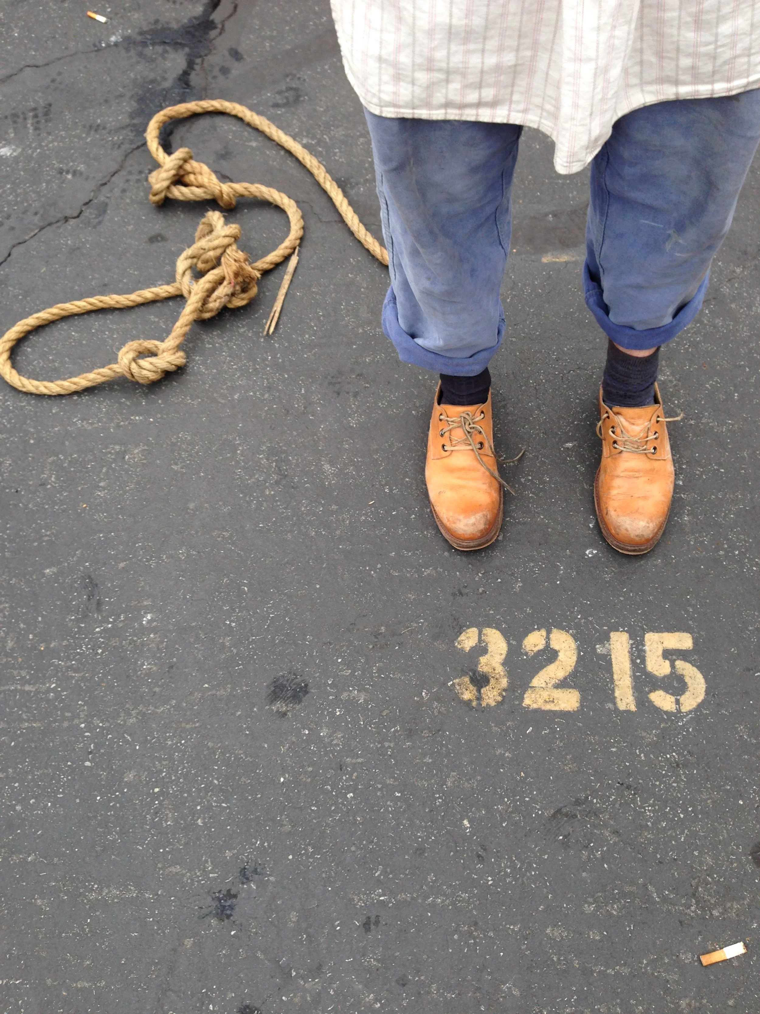
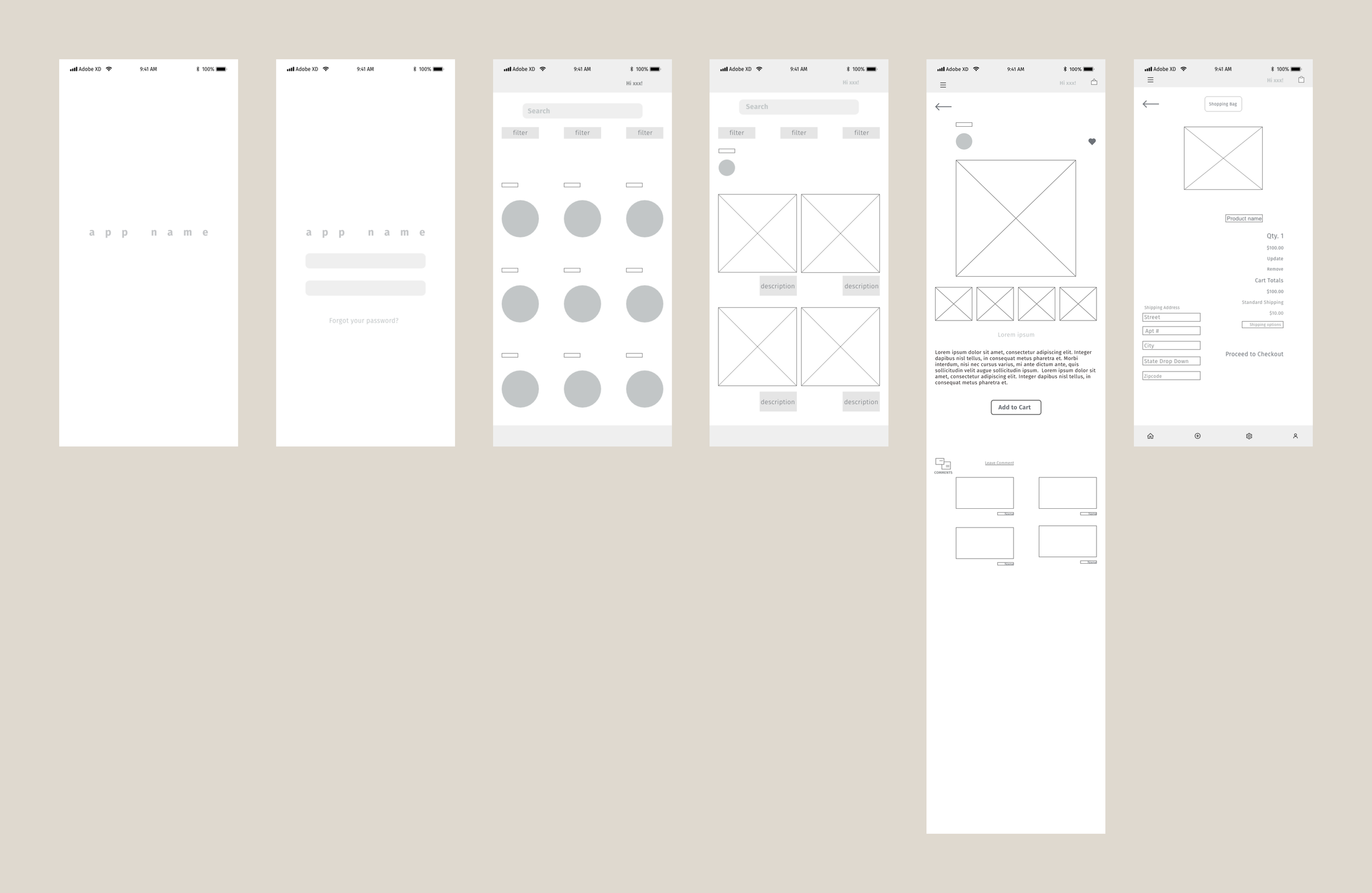
When I read the word “vintage clothing,” I imagined packed, hung, and squished pieces on the racks in the shop or stacked like mountains at flea markets. Vintage clothing shopping could be fun. It is like a treasure hunt, but it also could be overwhelming.
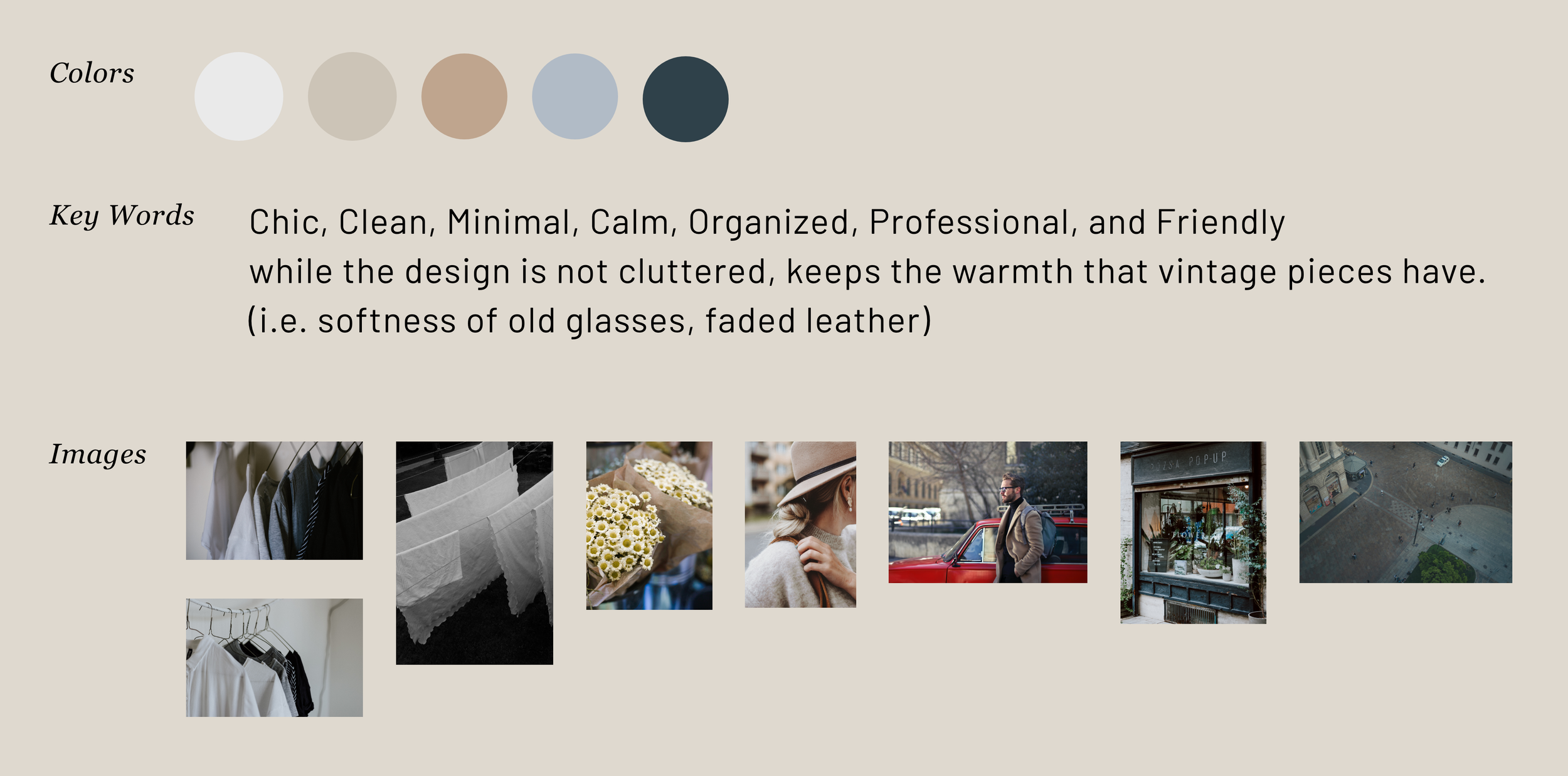
I decided to design the app to be clean and calm so that the users could focus on navigating the app and finding products. I imagined it more like a boutique shop than a flea market look. I thought less clutter of information, colors, and images was the key to highlighting the vintage products.
Based on these ideas, I started to collect inspirational images and build the mood board.
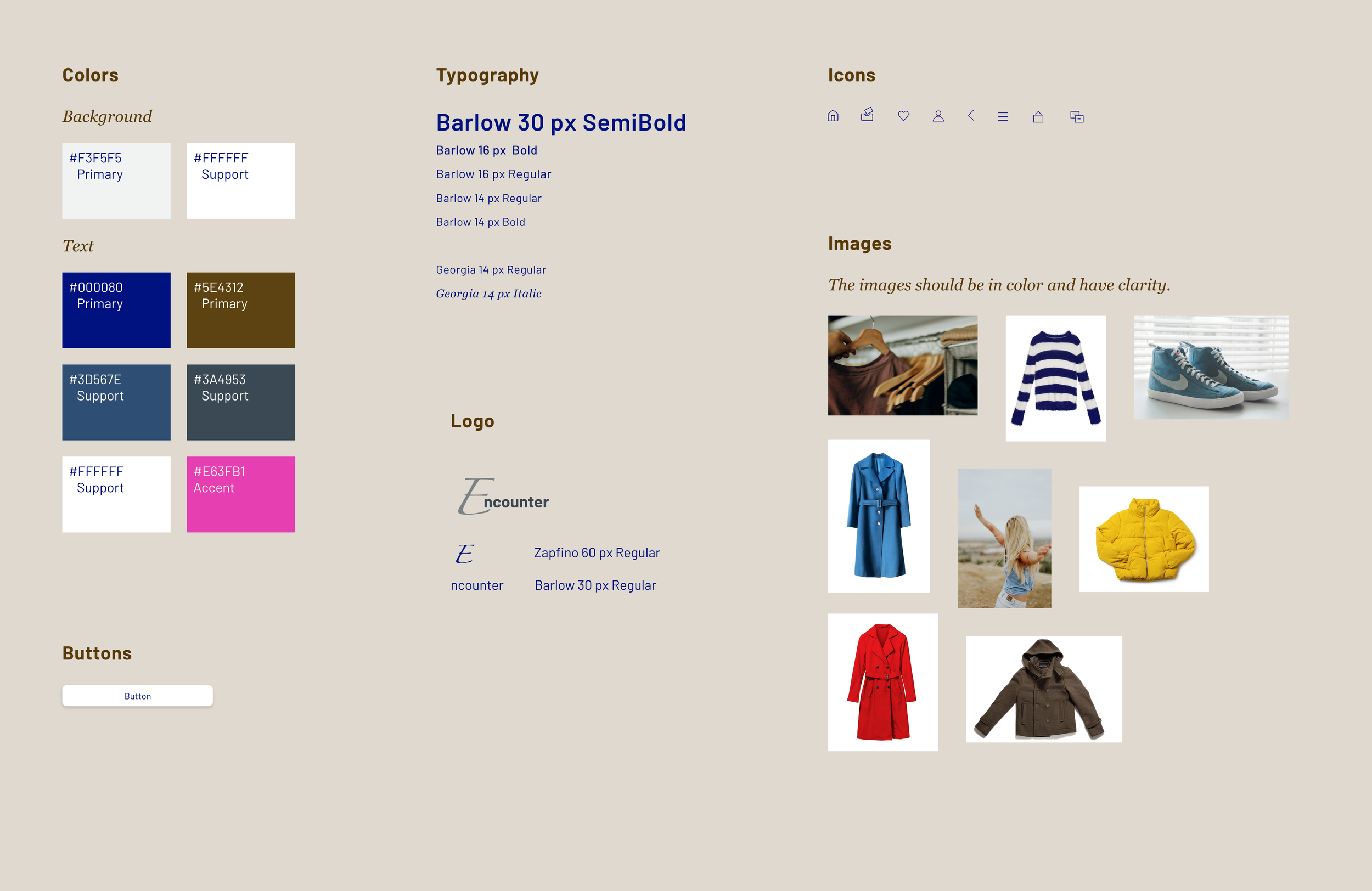
Mood Board / Concept
Logo Development
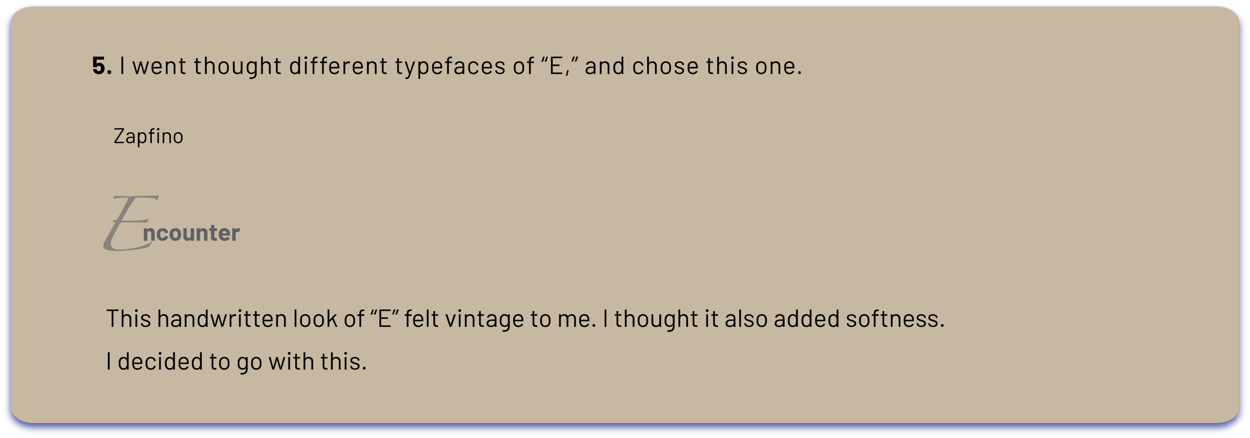
While the app has a clean and minimal look, I wanted it to have friendliness. I decided to develop a logo and see if I could add warmth to this app design.
Competitive Analysis
Next, I searched existing apps that the users can sell and buy vintage clothing such as The Real Real and Verstiaire.
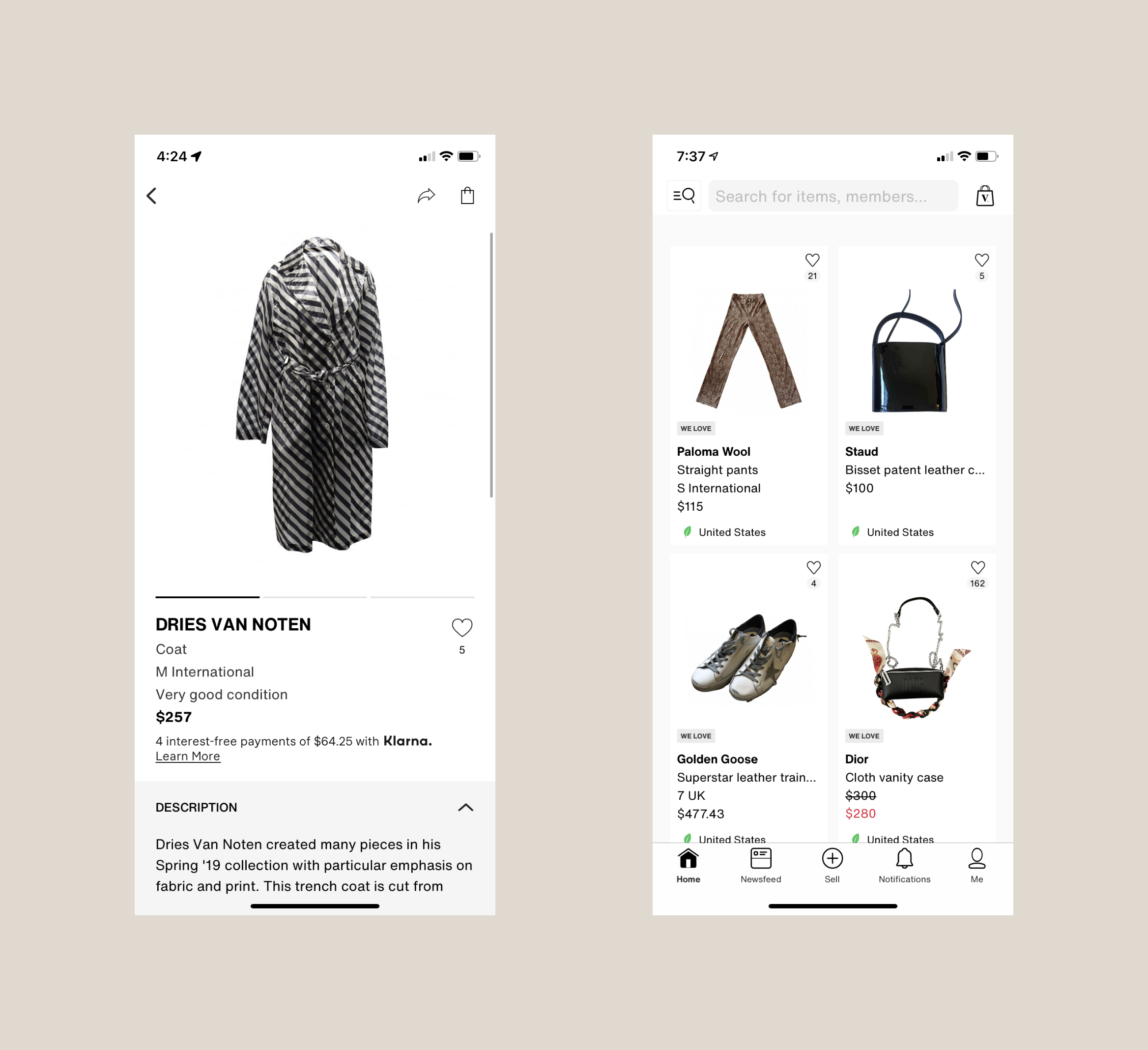
Key features include:
1. Upload items for selling
2. Browse categories and refine a search for purchasing
3. Create a profile
4. Leave reviews for other sellers
My key learnings were:
1. It is a clean design. There is a lot of information but
easy to navigate the pages and find the information because
of the way the pages were organized, the consistency of
the design, and the balance of the fonts.
2. Crisp and large images help the users to see the products well.
The organized categories and cards provide smooth navigation.
3. Clean look is inviting and motivational.