UI/UX Case Study • A Mobile Recipe app
Farmers market meets a recipe app
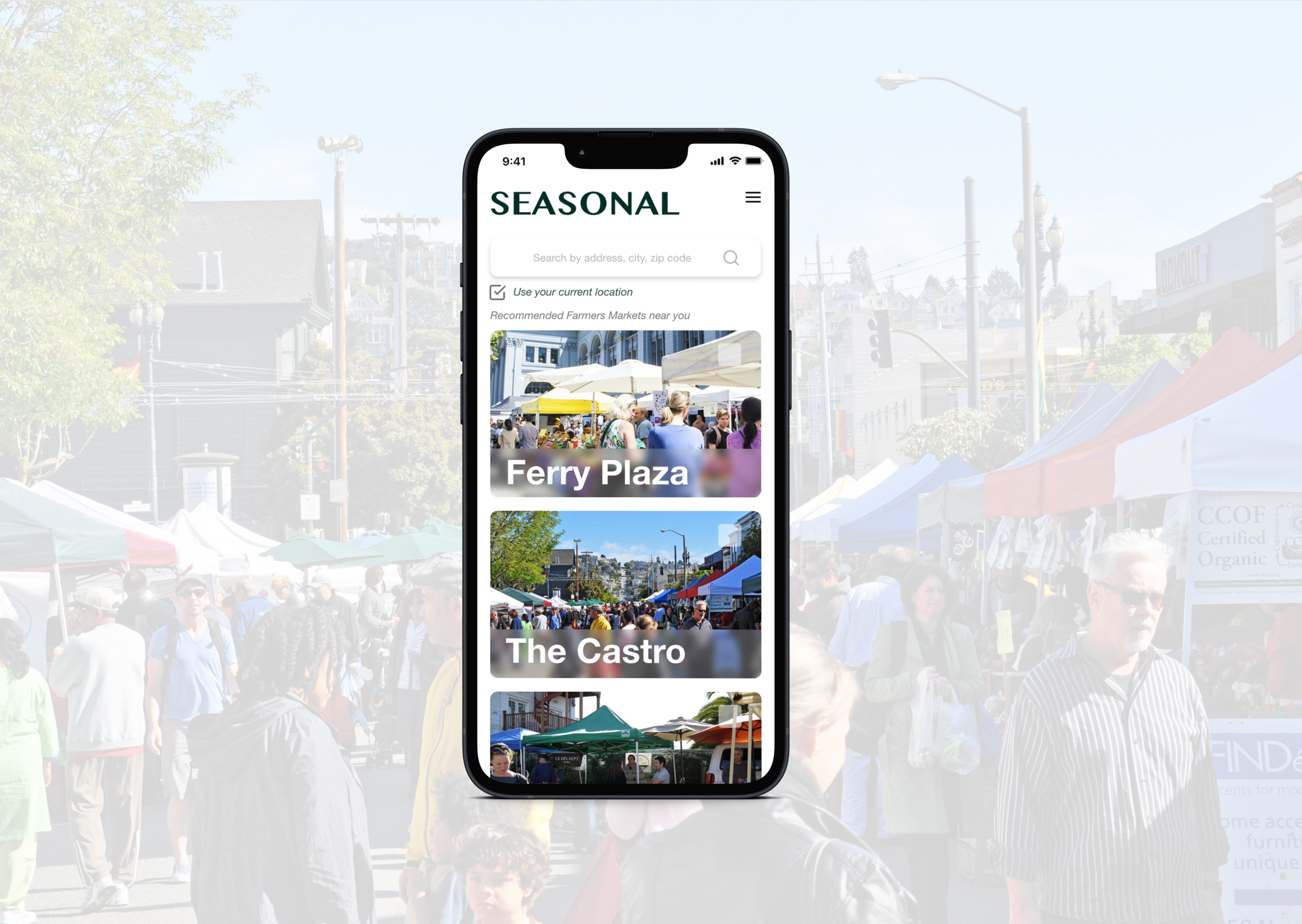
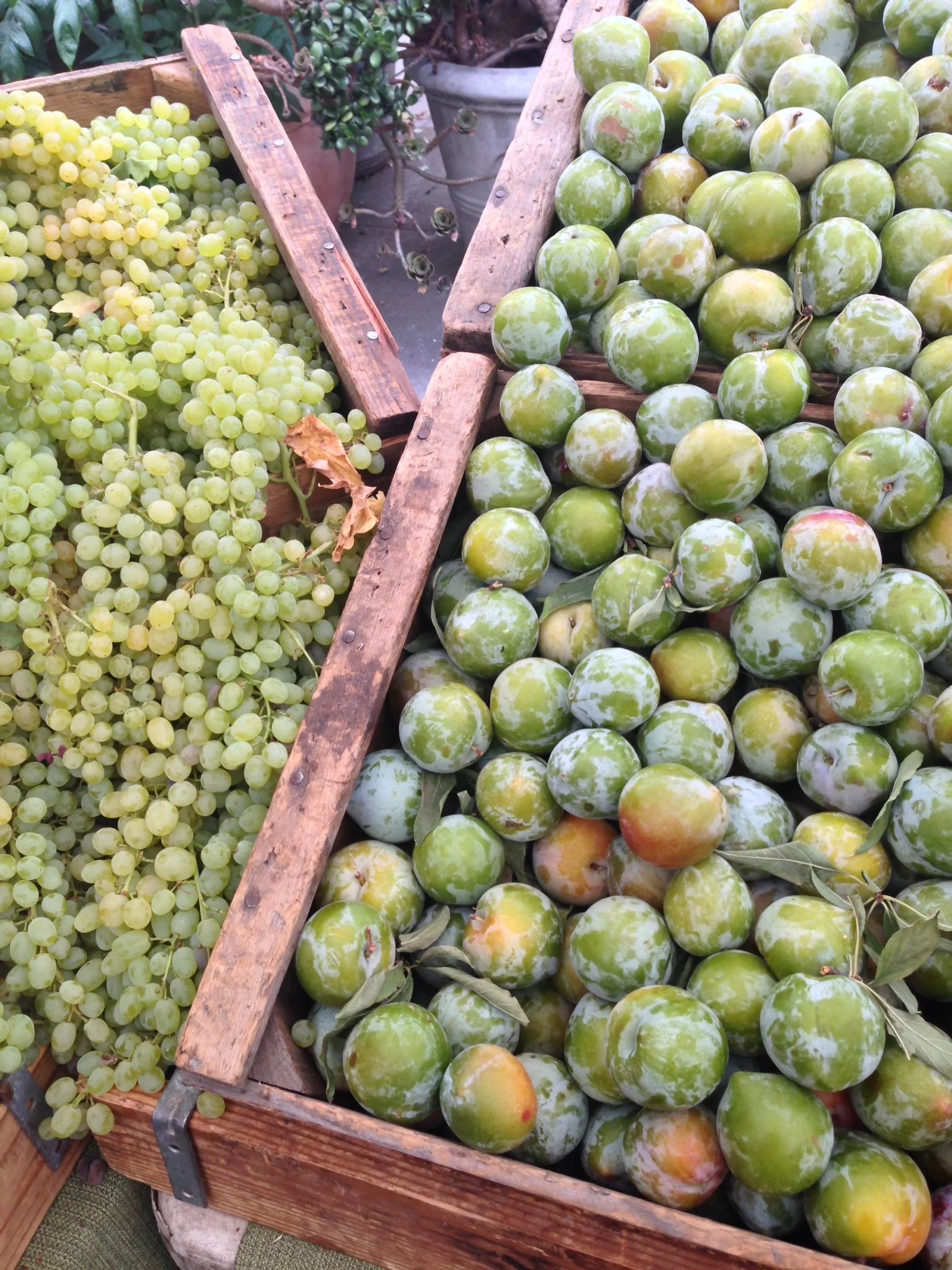
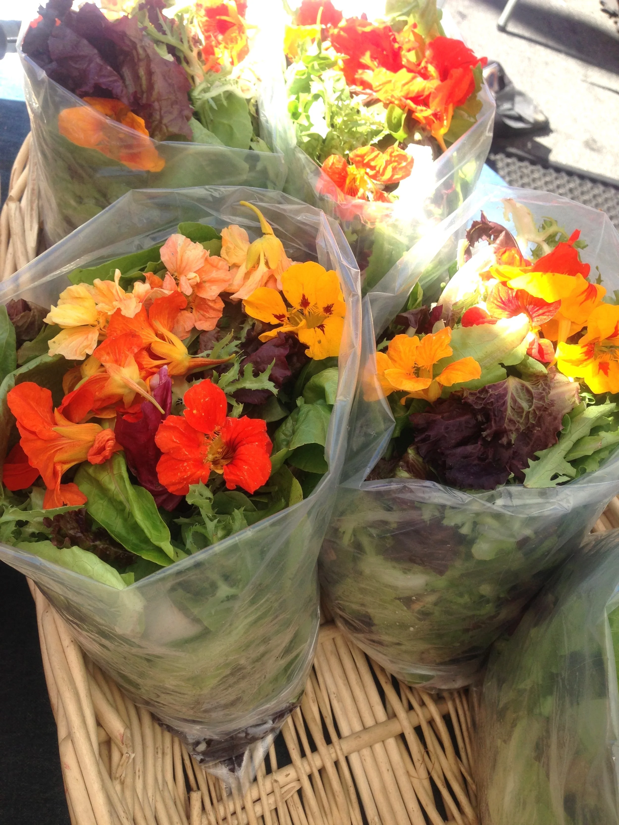
SEASONAL is a mobile recipe app that connects users and farmers markets.
It shows you the farmers market near you with the available fresh products and recipes.
You can get to eat seasonal products, communicate with the farmers, and feel a sense of
community in your neighborhood.
There was a farmers market in my neighborhood.
I loved fresh produce and wanted to eat better, so I decided to go one day.
Soon enough, I became a regular shopper. I discovered my favorite vendor.
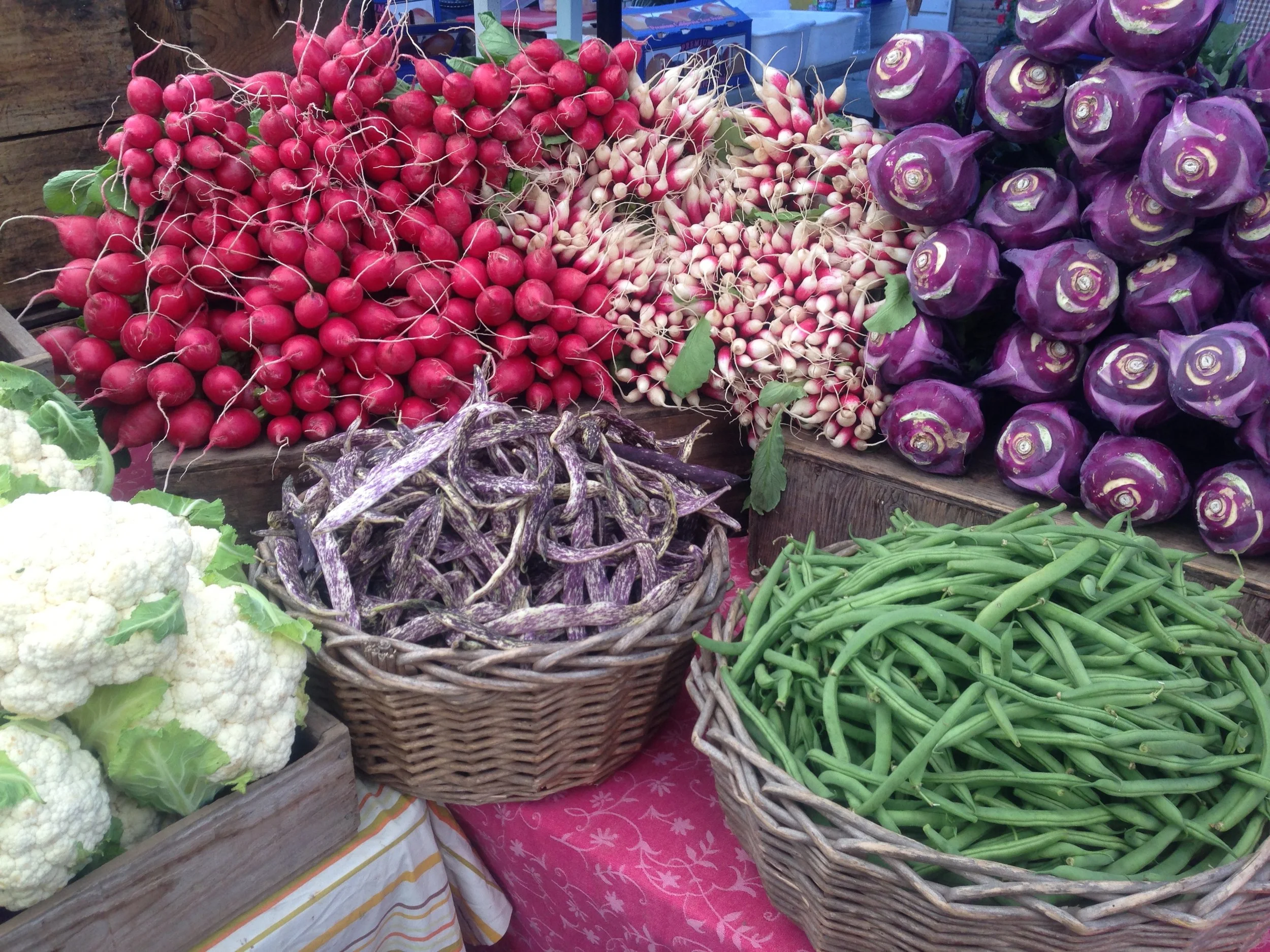
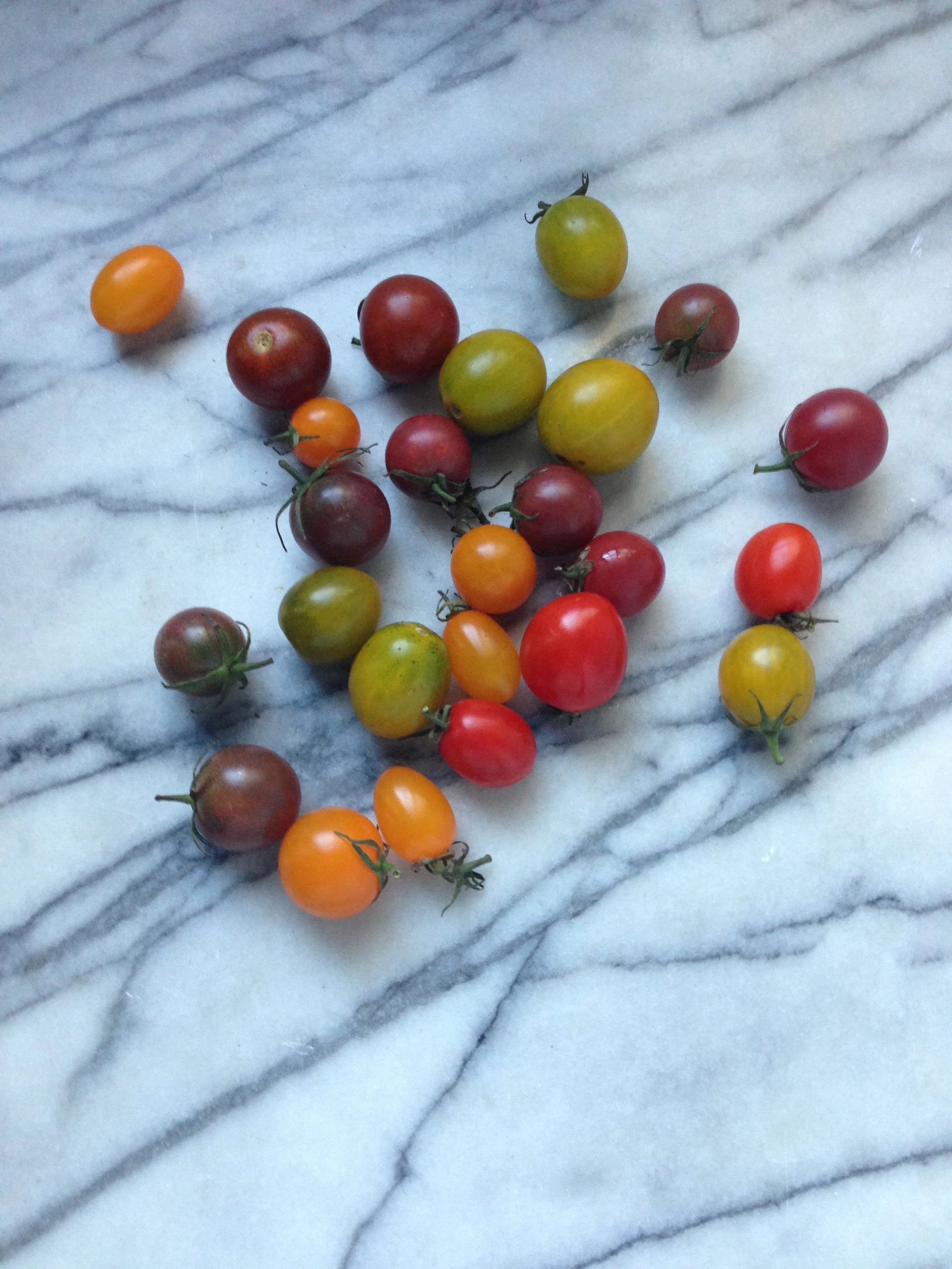
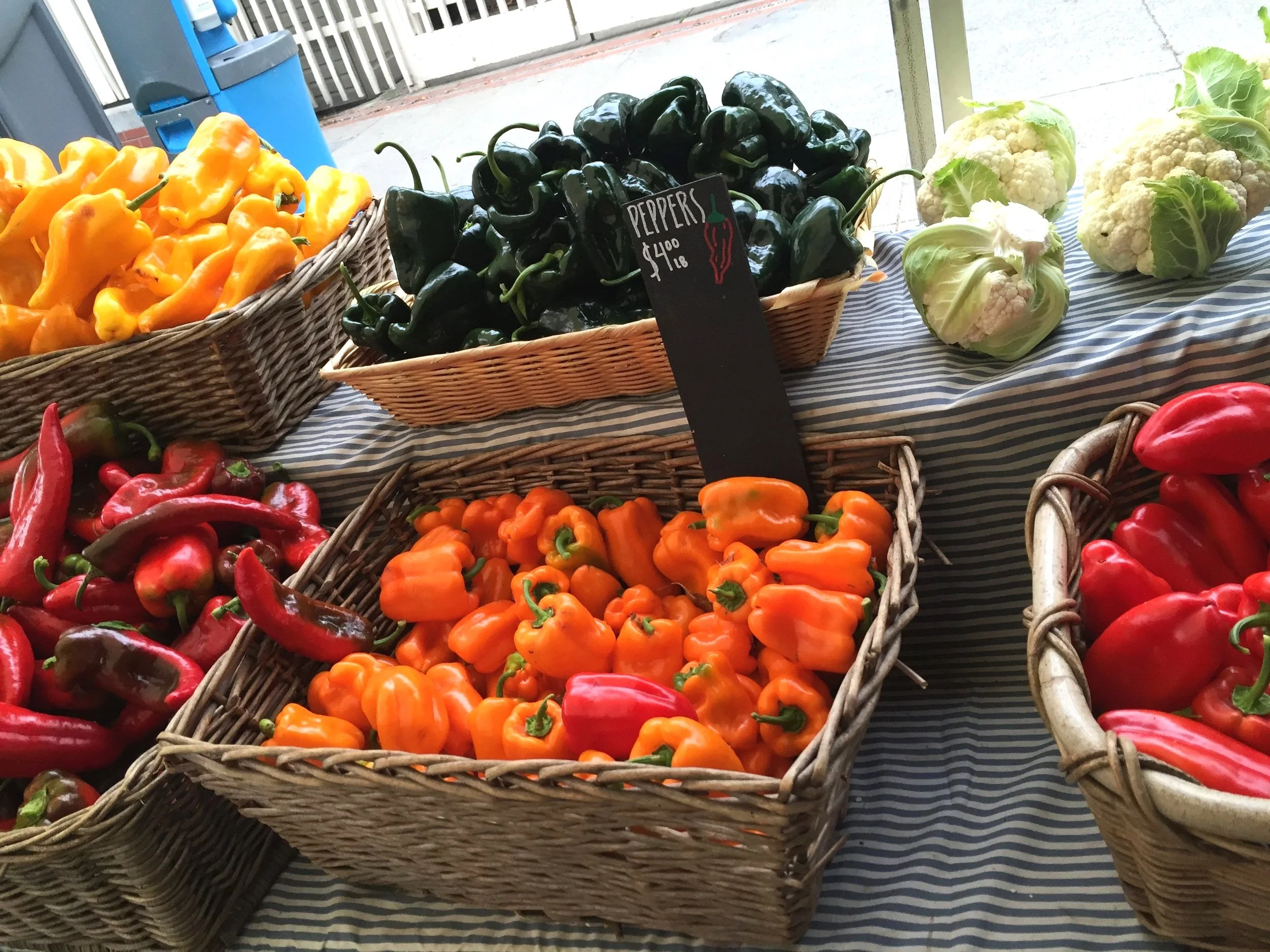
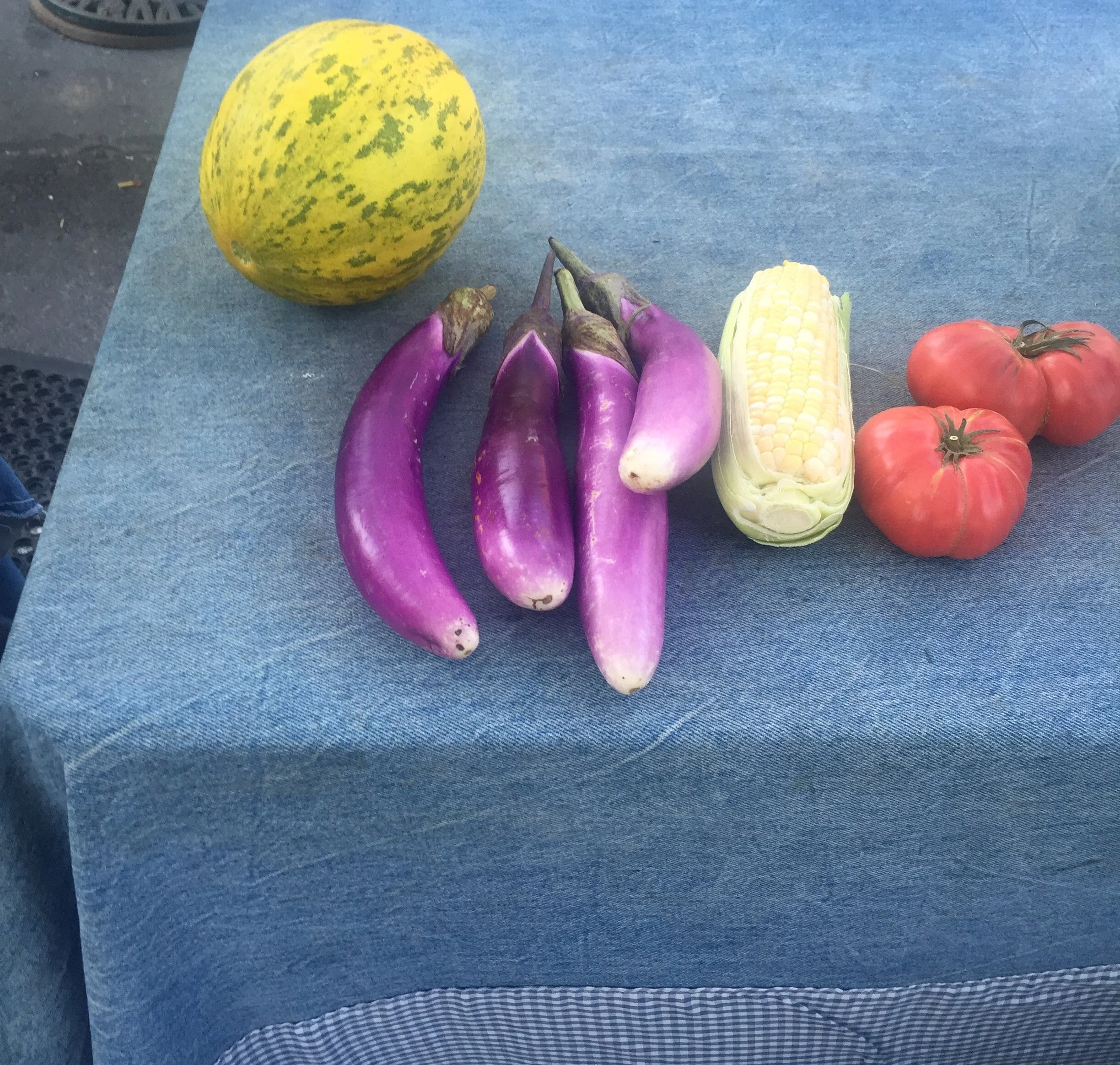
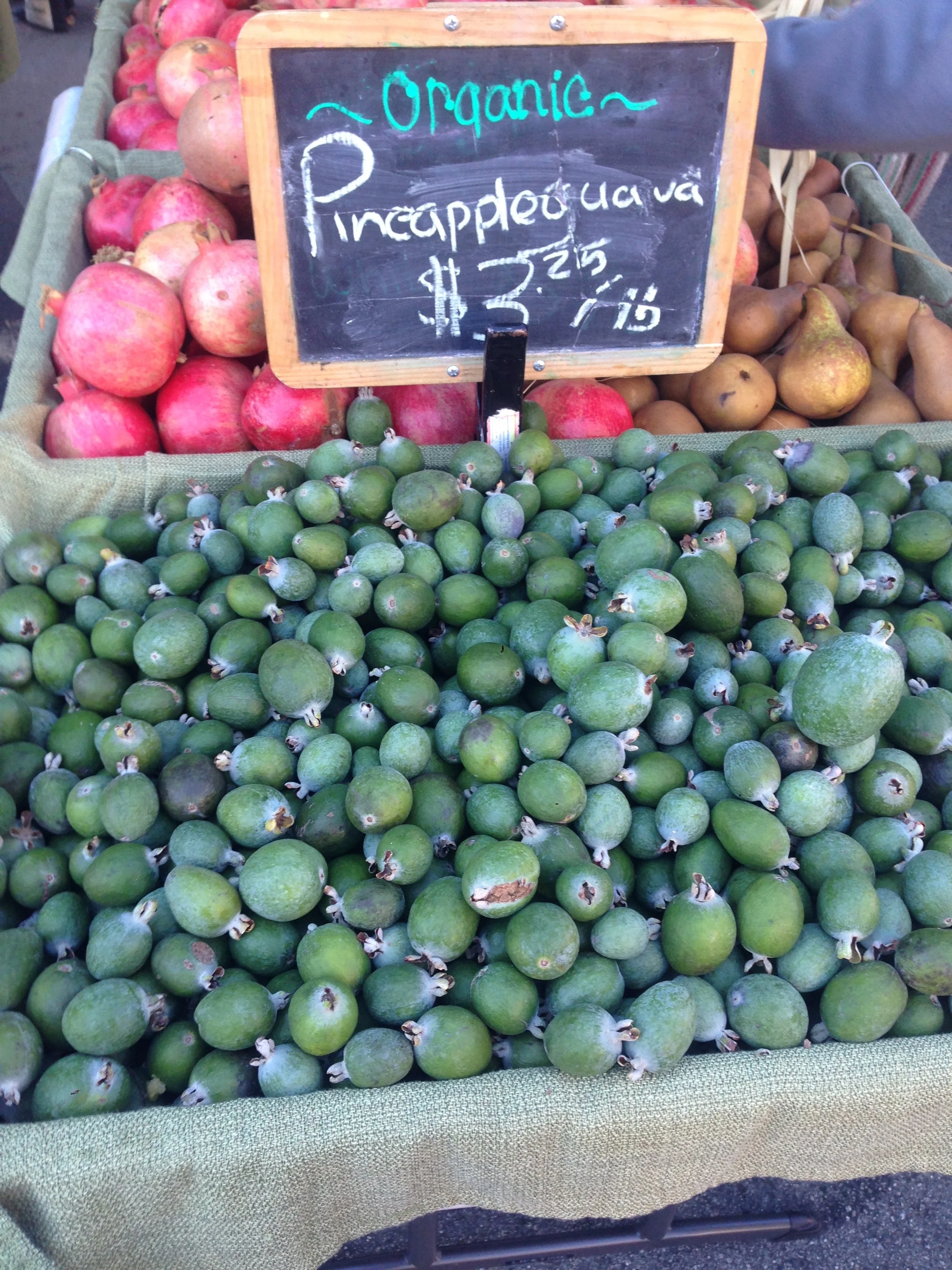
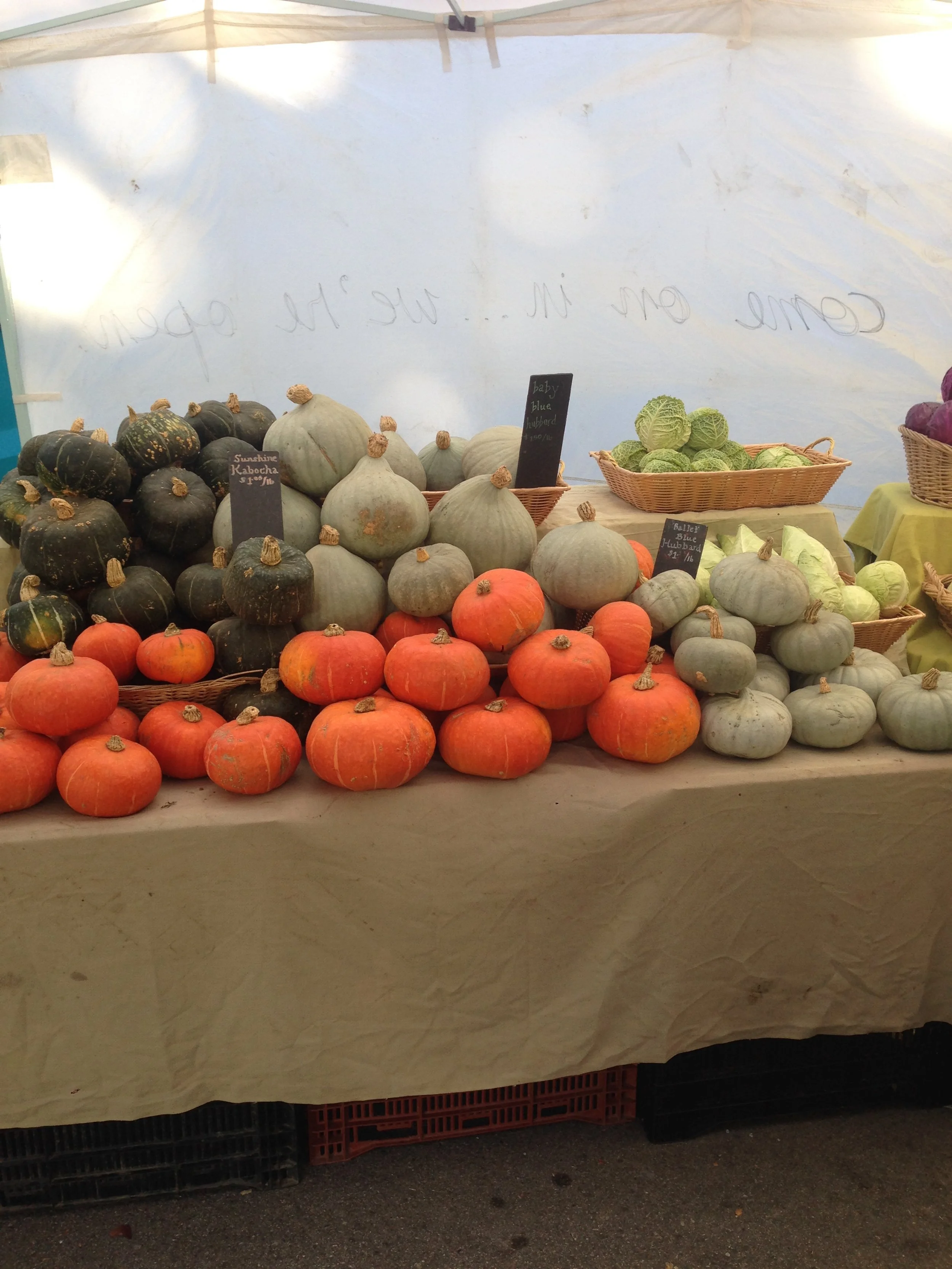
One day, a farmer at a stand recommended I try a vegetable in front of me.
I had never cooked it before. He told me how to cook it.
The vegetable was Romanesco. It was delicious and easy to deal with.
Why didn’t I try that before? This experience gave me the idea of the app.

UX Research Highlight
“I want to eat healthily, but I am busy.”
“I want to eat more seasonal produce but tend to buy packaged foods.”
“I know there is a farmers market nearby but shop for groceries at a large grocery store.”
“I am kind of bored with eating the same thing but too lazy to try new things I don’t know.”
Key problems
3 key problems: People are
1. too busy/lazy to go to farmers market
2. too busy to cook complicated meals
3. too lazy to explore new products if they don’t know what to do with them
Want to solve:
1. Encourage people to visit the local farmers market to eat fresh seasonal
produce, support and get connected to local farmers, and feel the
neighborhood community
2. The app should be simple and easy to use and the recipes also should be simple and
easy to follow
User Personas
I created three potential user personas based on the conversations of the research.

Meet Mitch Ryan
48 years old
Creative Director
Lives by himself in San Francisco, CA
He has a busy work schedule. His goal is to eat healthier and not rely on food takeout and delivery. There are several farmers markets near his apartment and his work.
“ I would like to see the images or videos of what’s cooking from above as if I was standing
in front of a kitchen counter. I don’t care about the person explaining as much.”

Meet Rachel smith
33 years old
Freelance Writer
Lives with her husband and two cats in San Francisco, CA
She works from home and enjoys having dinner parties on weekends. She tends to shop weekly at larger stores for groceries. She knows there are farmers markets in her neighborhood but is not familiar with them. She cooks the same kind of meals. She would like to explore new products and try new dishes.
“ If I knew what kind of product is available and comes with the recipes, I may try to go to
the farmers market more.”

Meet akiko shibata
29 years old
Part-time Proofreader
Lives with her husband and two daughters in Tokyo, Japan
As she juggles her family’s busy schedules and saves time and money, she uses pre-cooked and packaged foods often. Her goal is to save money and also eat healthily.
“I’ve gone to a farmers market, and when I did, I was so excited to see all the fresh and
beautiful products with reasonable prices. To me, going to the farmers market is to enjoy
being there as well as buying products.”
User Stories and User Flows

Inspirations
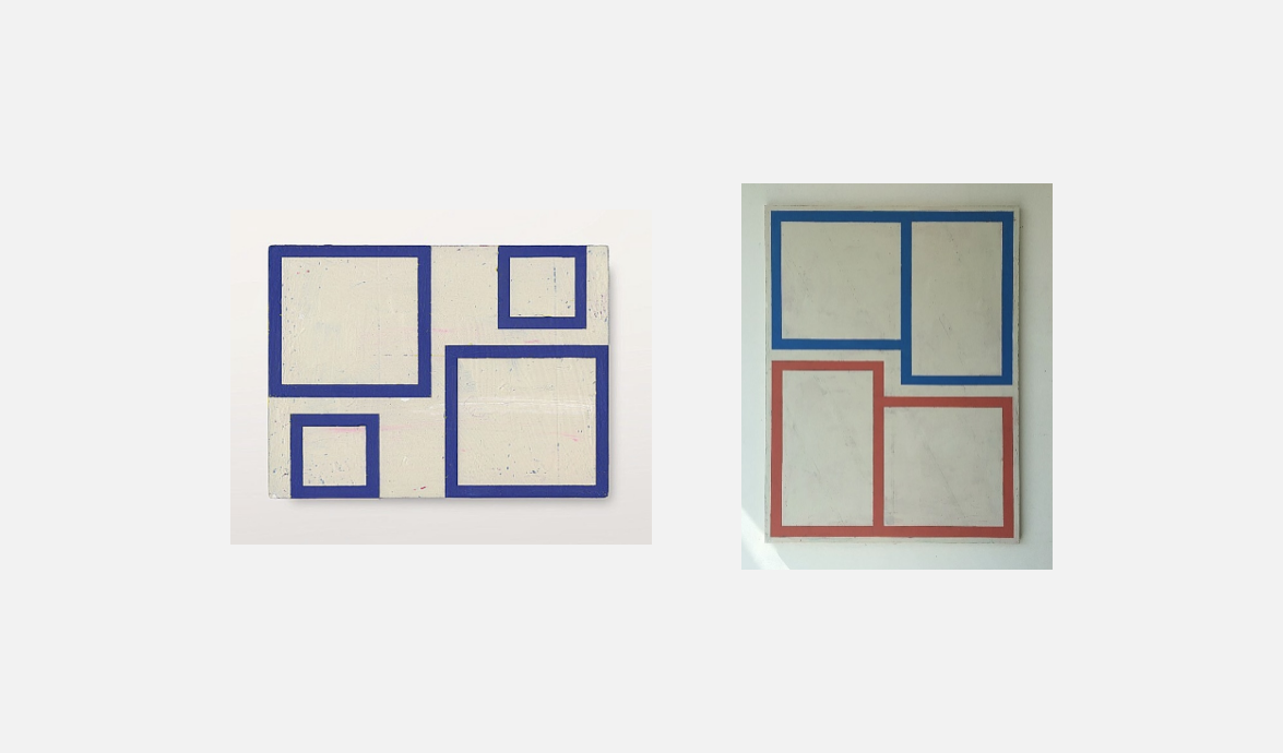
I was inspired by these two designs by the artist Alain Biltereyst and wanted to use some boxes like these throughout the pages.
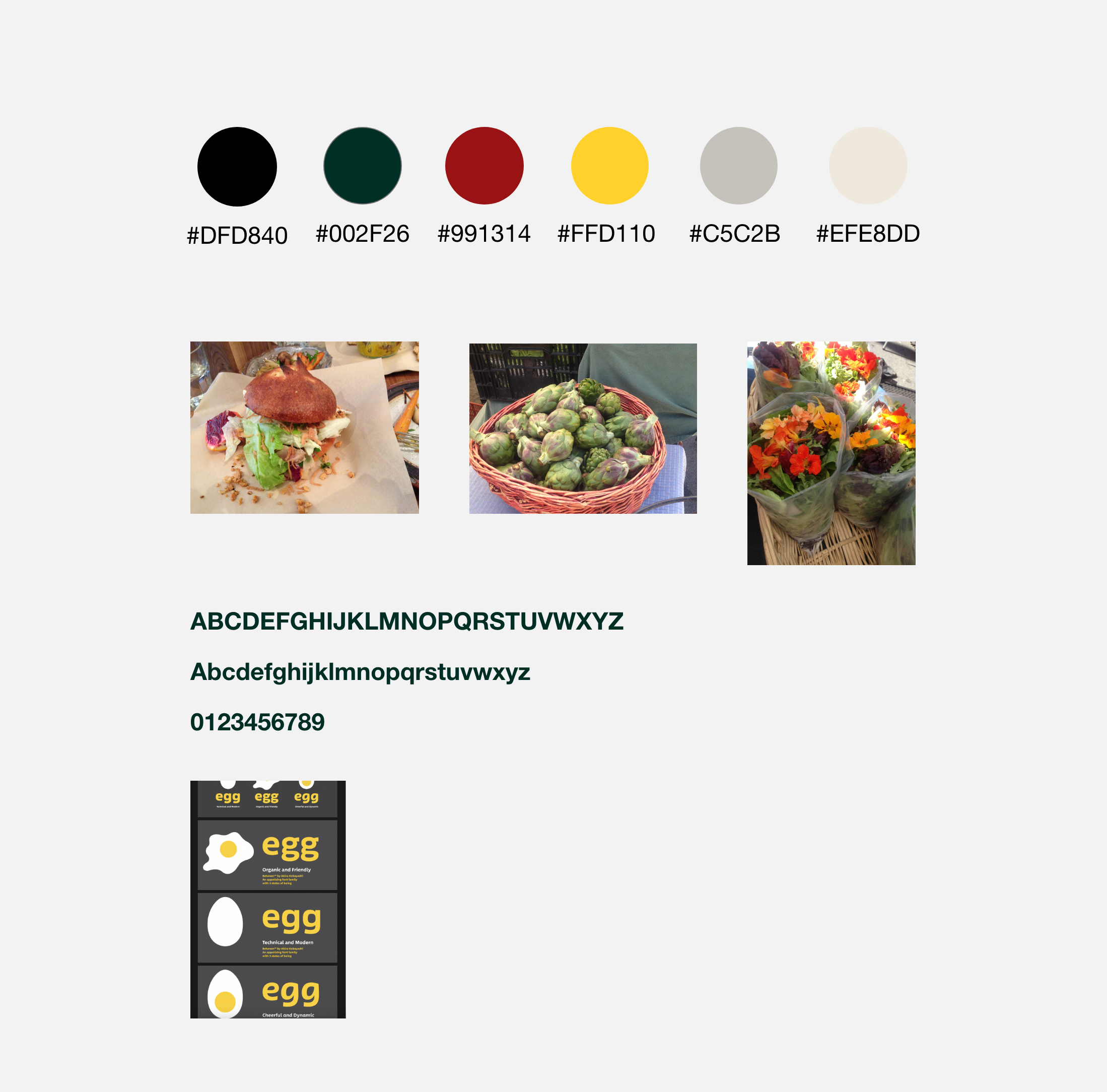
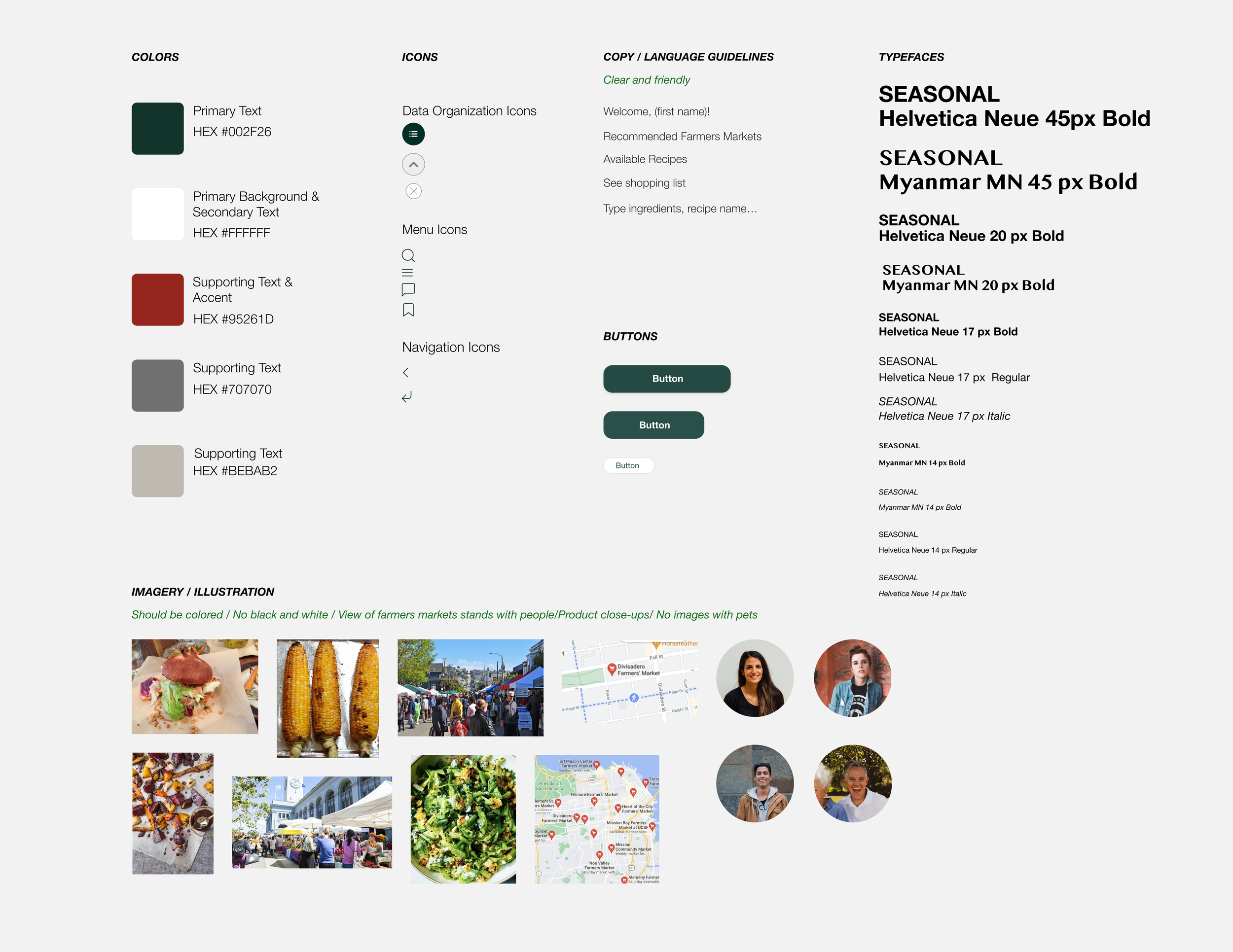
I was also inspired by warm, natural, earthy colors, vivid images, and clean and inviting typefaces that the users could imagine on a sunny day at a farmers market.
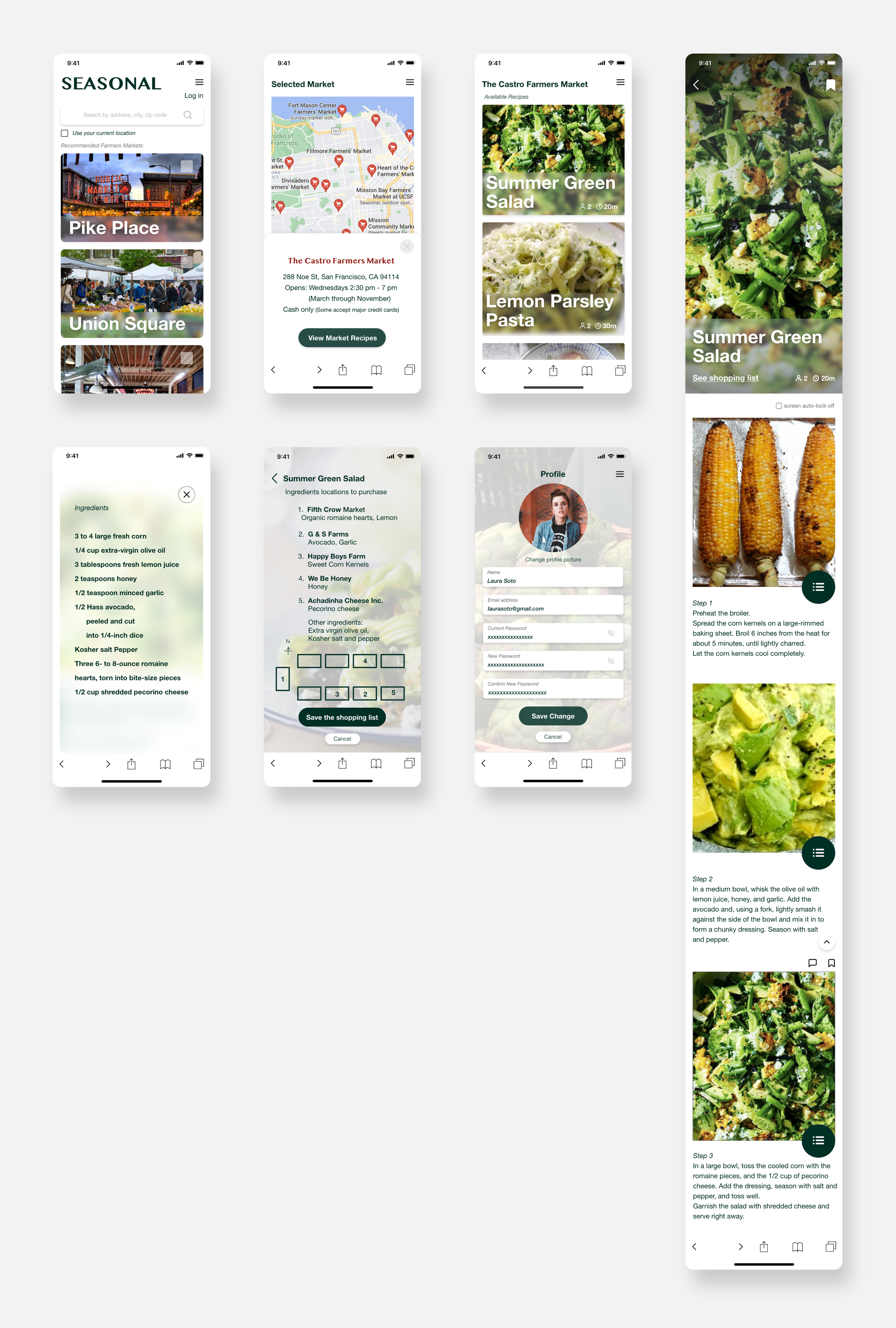
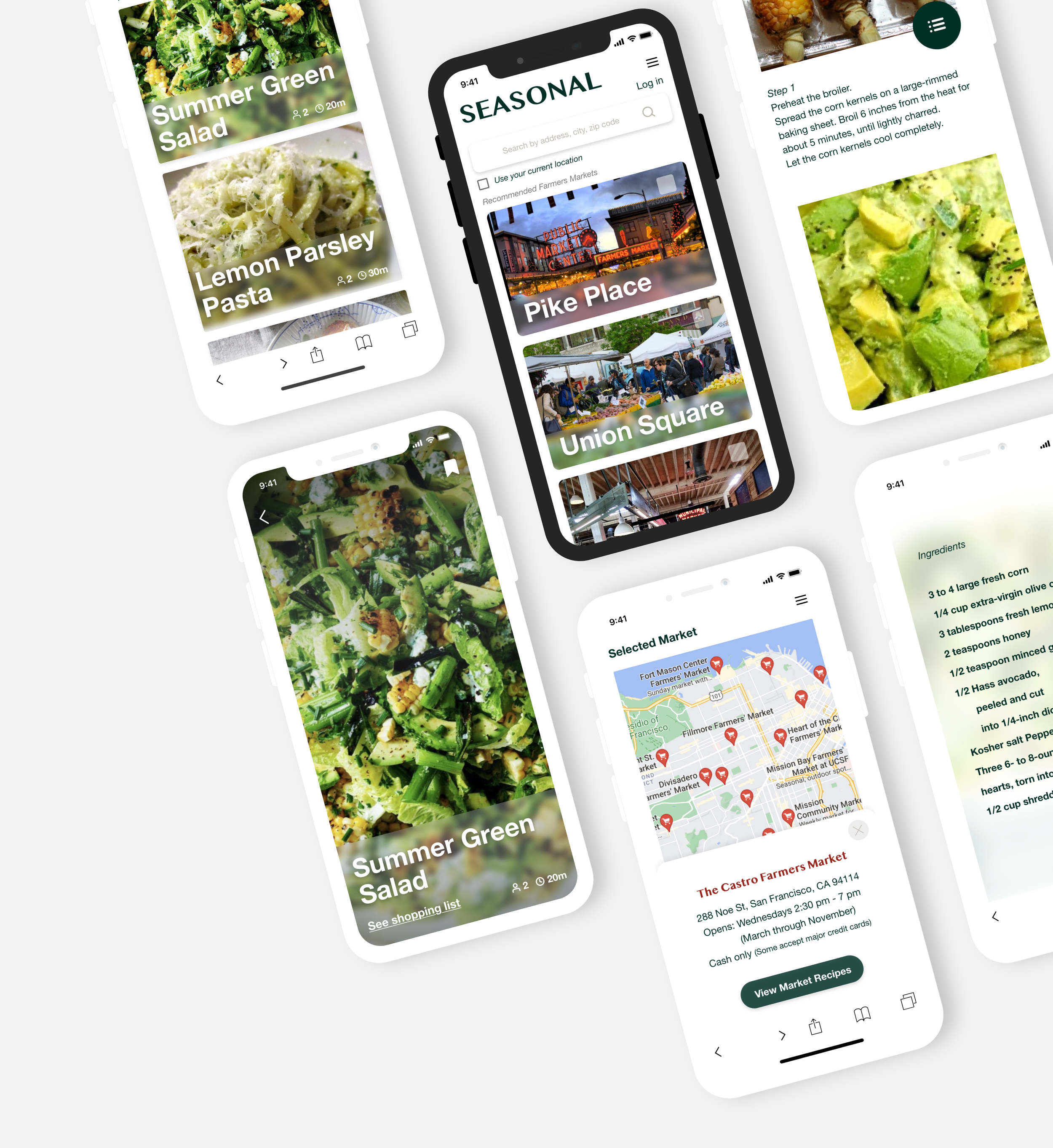
Low Fidelity Wireframe
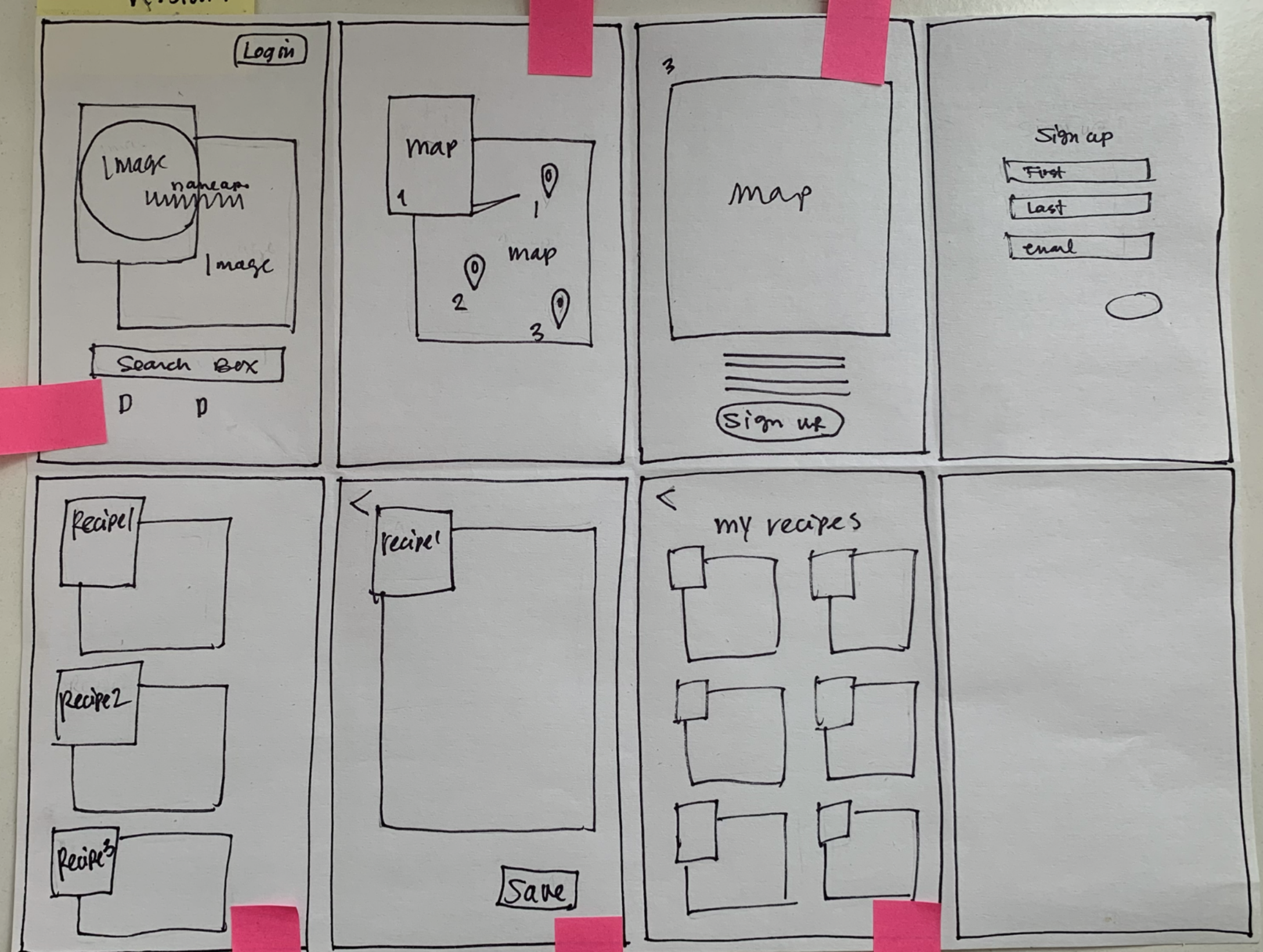
I wanted to use the two boxes design on the pages.
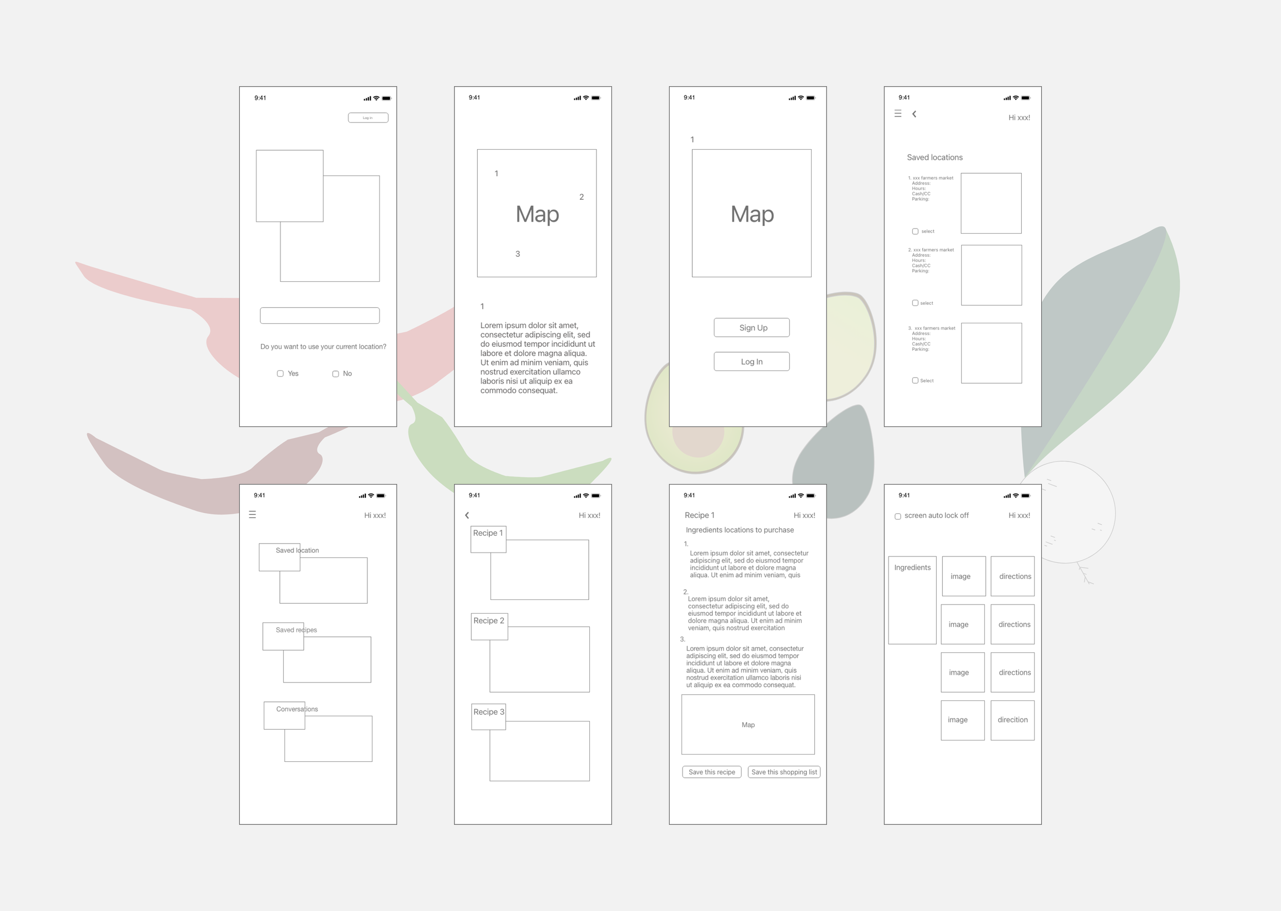
Mid Fidelity Wireframe
High Fidelity Wireframe
I was working on designing the pages by using the two-boxes concept I had,
but after reviewing them with my mentor, we agreed that the design could be confusing
for the users as they are not a familiar style of mobile design.
I also thought the colors were not as attractive, warm, and inviting as I thought they would be.
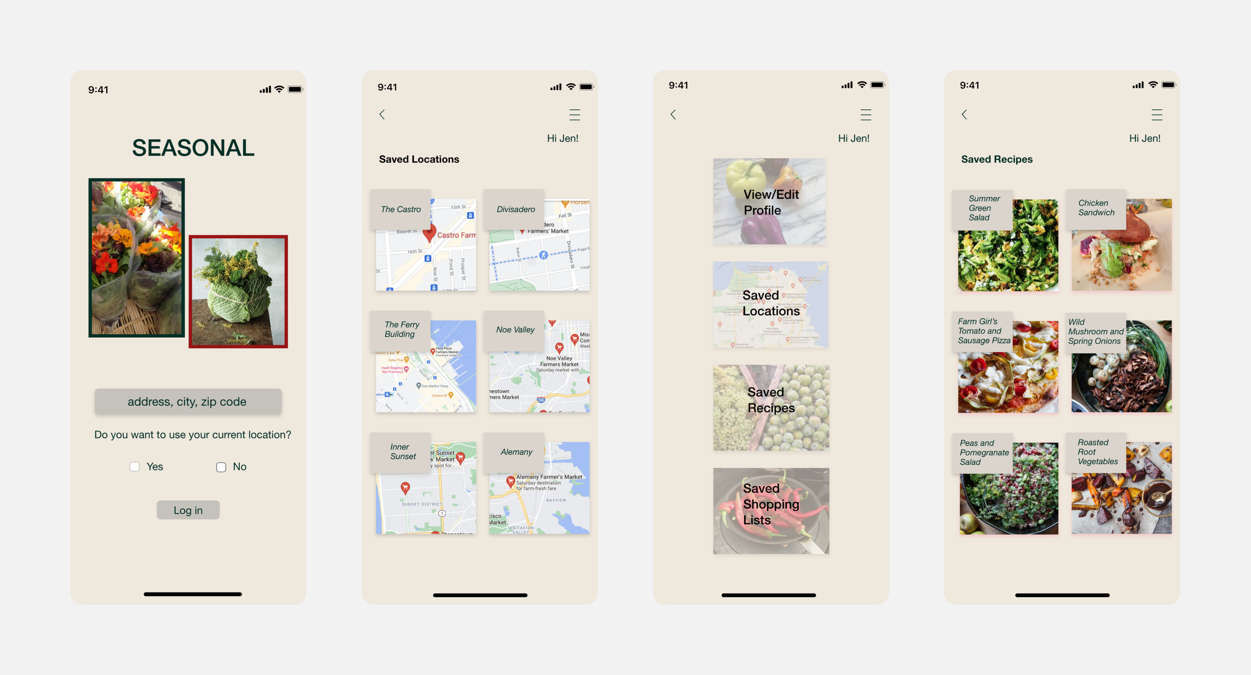
Design Change
I decided to change the design and tried to be still simple and use familiar shapes.
Inspirational mobile pages
Before and After the change

Before After Before After